
Feeture Onboarding:
From Registration to Activation
Turning onboarding from a form into the product's first real value moment.
Challenge
When MVP launched, onboarding performed well by every standard metric. Despite a 90% onboarding completion rate,
less than 10% of users ever initiated a collaboration. Onboarding was registering users but not helping activate them, users weren't collaborating.
Project timeline
Apr 2026–Now
Industry
Music & Entertainment
Type
iOS, Web App
My role
Senior Product Designer
Team
2 Non-Tech Founders
1 Product Designer
1 Product Manager
Development Team
The problem with a 90% completion rate
That disconnect forced a harder question: what is onboarding actually for? Completion was never the goal — activation was. A 90% completion rate on the wrong experience just meant we were efficiently moving people into confusion.
Users finished onboarding, landed in the app, and stopped. They weren't making offers. They weren't responding to them. They'd built a profile — but had no mental model of what Feeture was for, what their role was, or what to do next.
Understanding V1: what we built and why
The original onboarding was designed around one constraint: we needed a lot of information to make the product work, and we needed it upfront.
V1 structure:
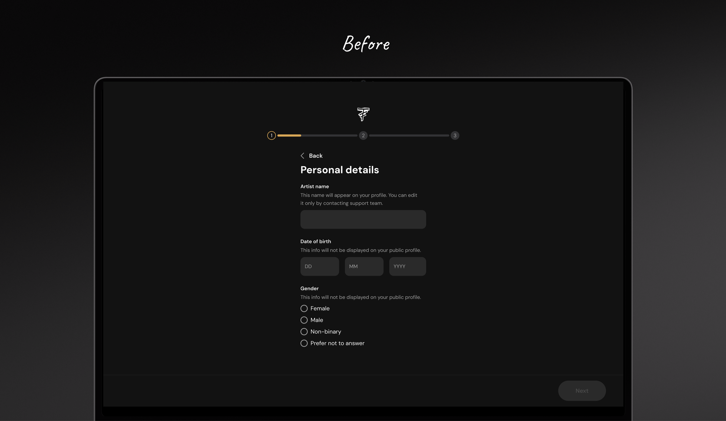
About You — name, gender, solo or band, genres, a song, location, profile image
Feeture Terms — fee, delivery time, revisions, refund policy, royalties, primary rights, explicit content
Verification — later replaced with song upload
The design approach was sound. I organized everything into three logical sections, applied a one screen one question principle throughout, used pre-selected defaults where possible, and added progress indicators to reduce the feeling of length. It worked — 90% completion proved that.
But V1 had a fundamental problem that metrics couldn't show: we were asking for everything and giving nothing back.
No context about what Feeture was. No explanation of how collaboration worked. No sense of what came next. Users arrived as strangers and left as strangers who'd filled out an easy to fill form.
The product vision for V2 was:
make onboarding help activate users,
not just register them.
After a series of user interviews, surveys, product sessions we narrowed down the following structure.
V2 structure:
Goals — make offers, receive them, or both
Budget — how much are you ready to spend on collab
Spotify link
Genres
Location
Growth projection
Feeture Terms — with fee education and AI-suggested rate
Collaborator recommendations
Subscription
Education tips across all steps
KEY DECISIONS1. Starting with goals, not identity
V1 opened with basic profile information. V2 opens with a different question: why are you here? Are you looking to make offers, receive them, or both? This establishes the mental model of how Feeture works from the very first interaction.
On Feeture there are two roles:
Artist A who initiates and pays, and Artist B who executes and gets paid.
Every artist can be both.
Making this explicit at the start removes the confusion that was causing drop-off later in the funnel.
2. Pulling data from Spotify instead
of asking for it
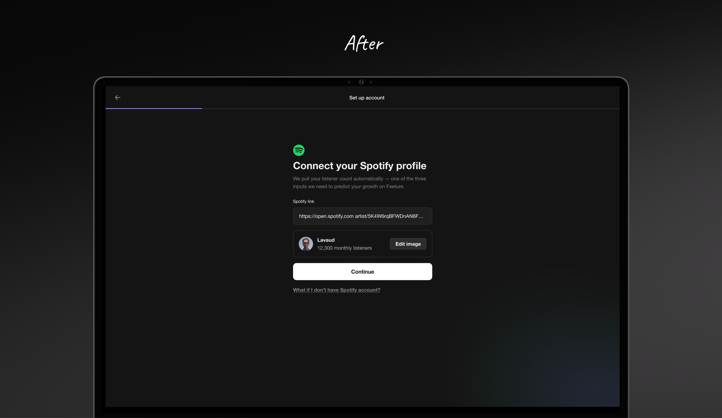
We tested pulling artist data directly from a Spotify link — genre, audience size, profile information. The data was inconsistent across artists, so we scoped it to what was reliably available in all scenarios and designed around that baseline. It eliminated several manual input screens and gave us verified audience data to power the features that came next.
3. The AI growth projection
After entering their Spotify link, genres, and location, users see
a personalised AI growth projection — showing what artists with
a similar profile typically experience after their first collaboration on Feeture.
This was the most significant structural shift in V2.
V1 gave users a form to fill out. V2 gives them growth projection & collab matches. It reframes onboarding from a form into a discovery process.
4. Suggesting a fee instead of asking
for one
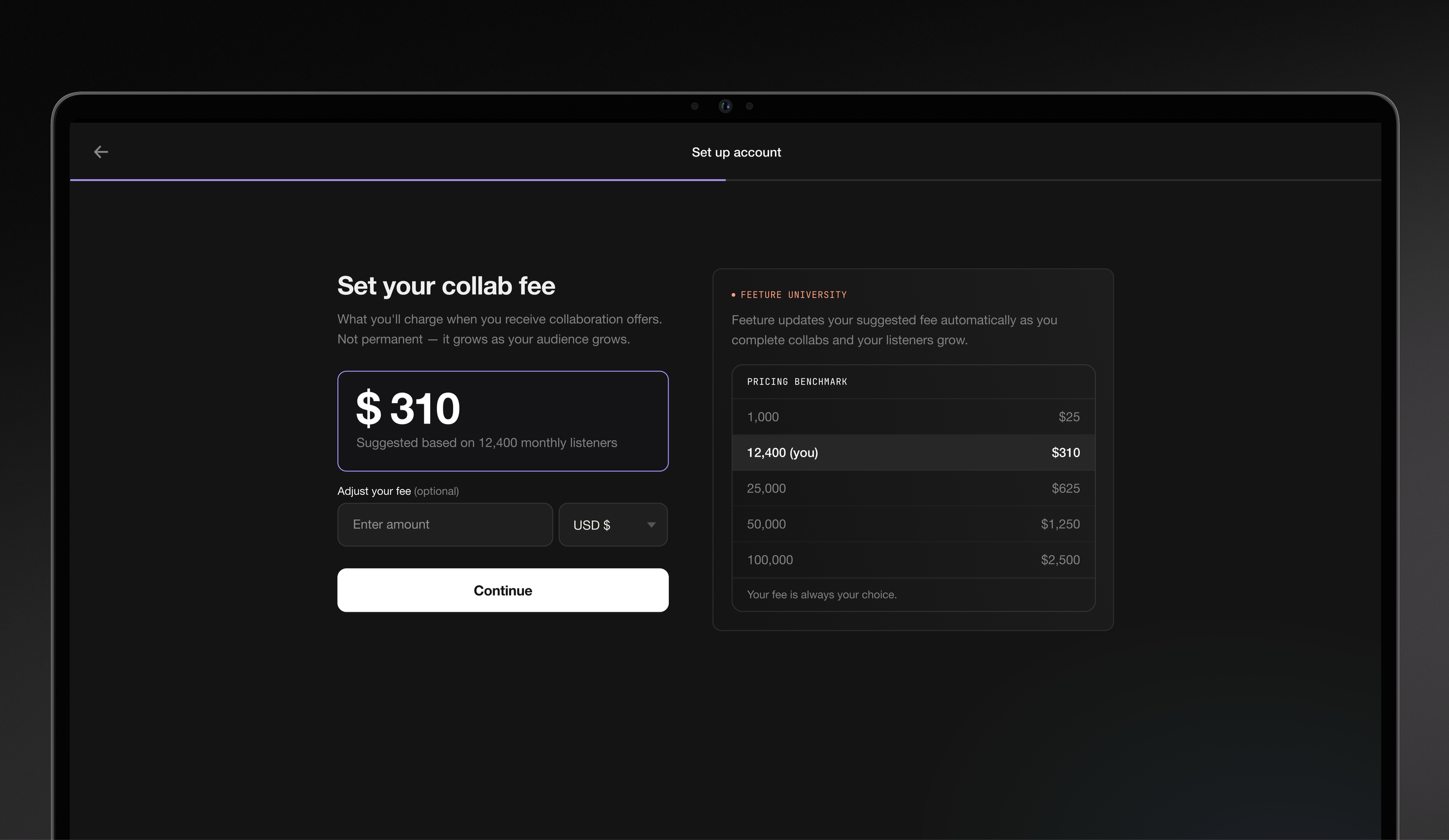
V2 suggests a fee based on their Spotify listener count, grounded in the founder's vision of creating standardised marketplace pricing that doesn't exist anywhere else in the industry.
5. Ending with collab recommendation
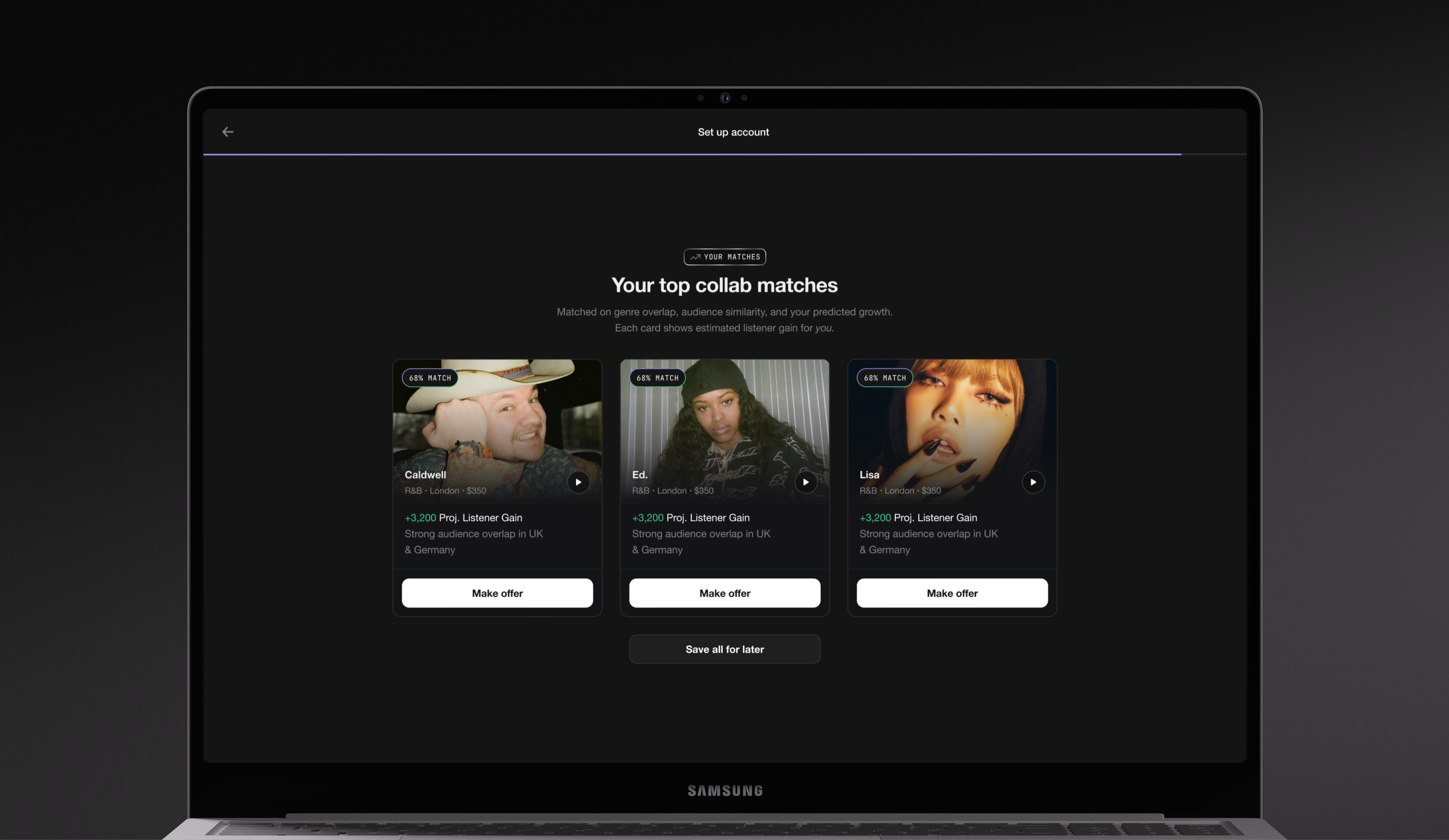
V1 deposited users into the app with a complete profile and no direction. V2 ends with personalised collaborator recommendations based on everything they've shared. The first screen after onboarding isn't an empty explore page — it's people they might actually want to work with.
Before & After
Adding the Spotify link let us replace several manual input fields by pulling that data directly from Spotify instead.
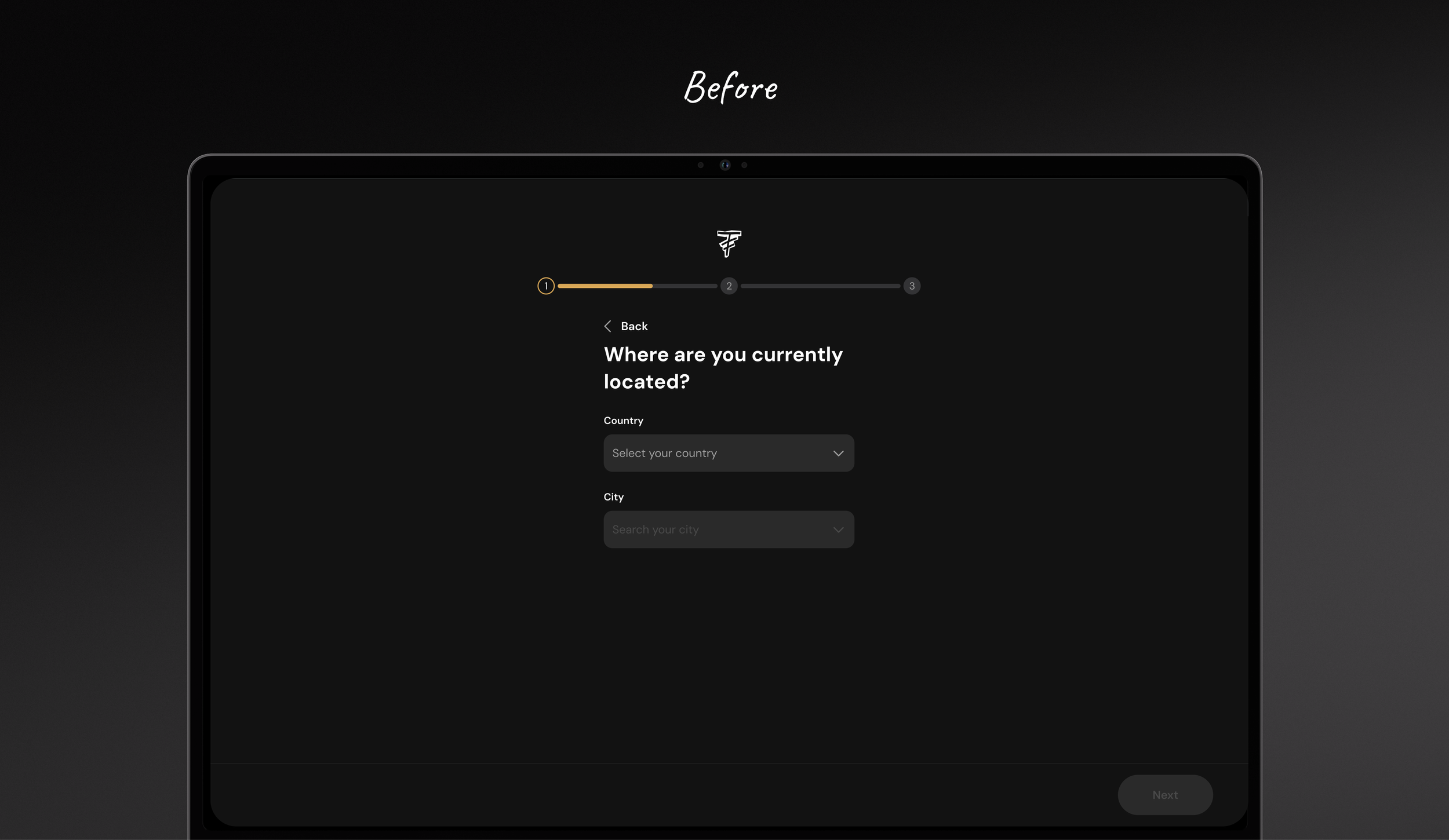
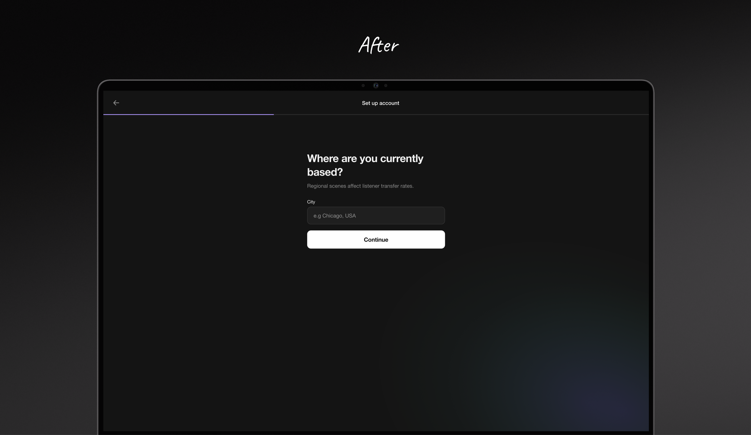
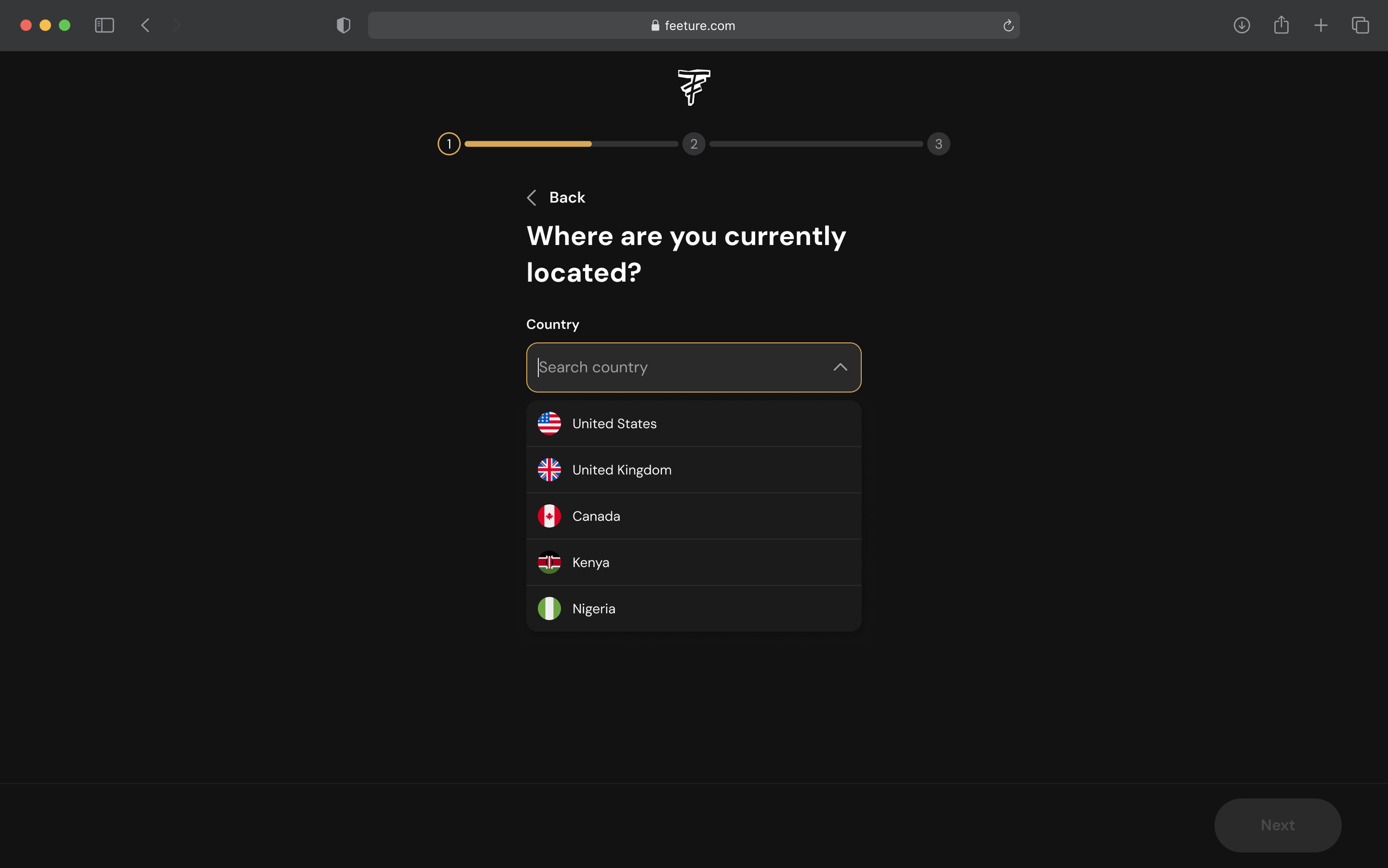
Before: location was two separate dropdowns — pick a country, then a city. After: a single field with auto-suggest. It's faster for users and removes the clunky two-step selection we shipped in V1 to save time early on.
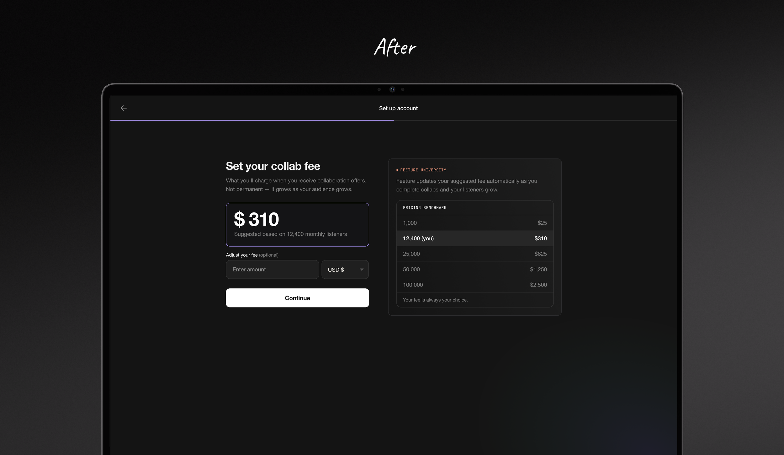
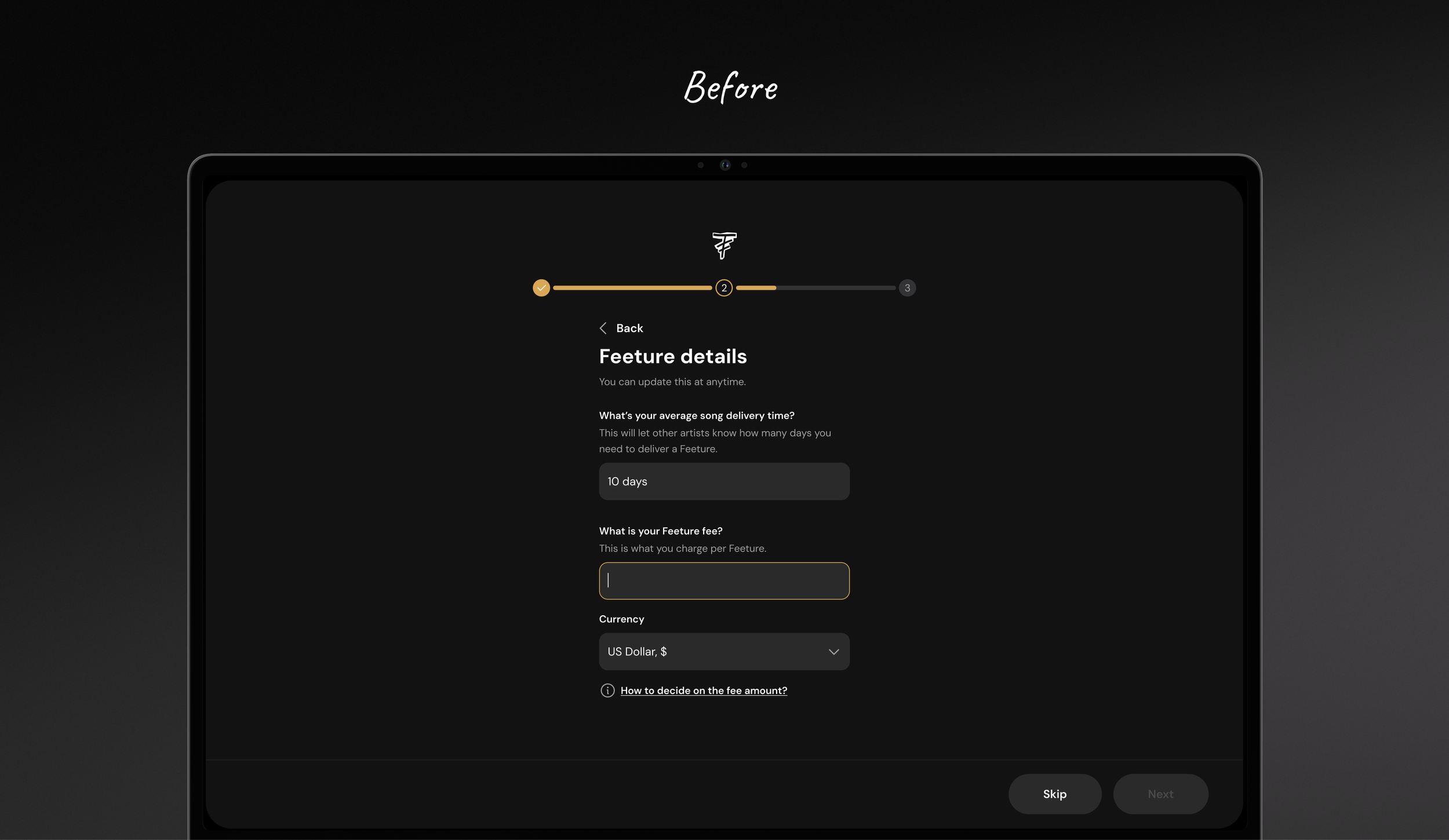
Before: artists had to set their own collaboration fee with no reference point. After: we suggest a fee based on their listener count, so new artists have a starting point instead of guessing.
New Features
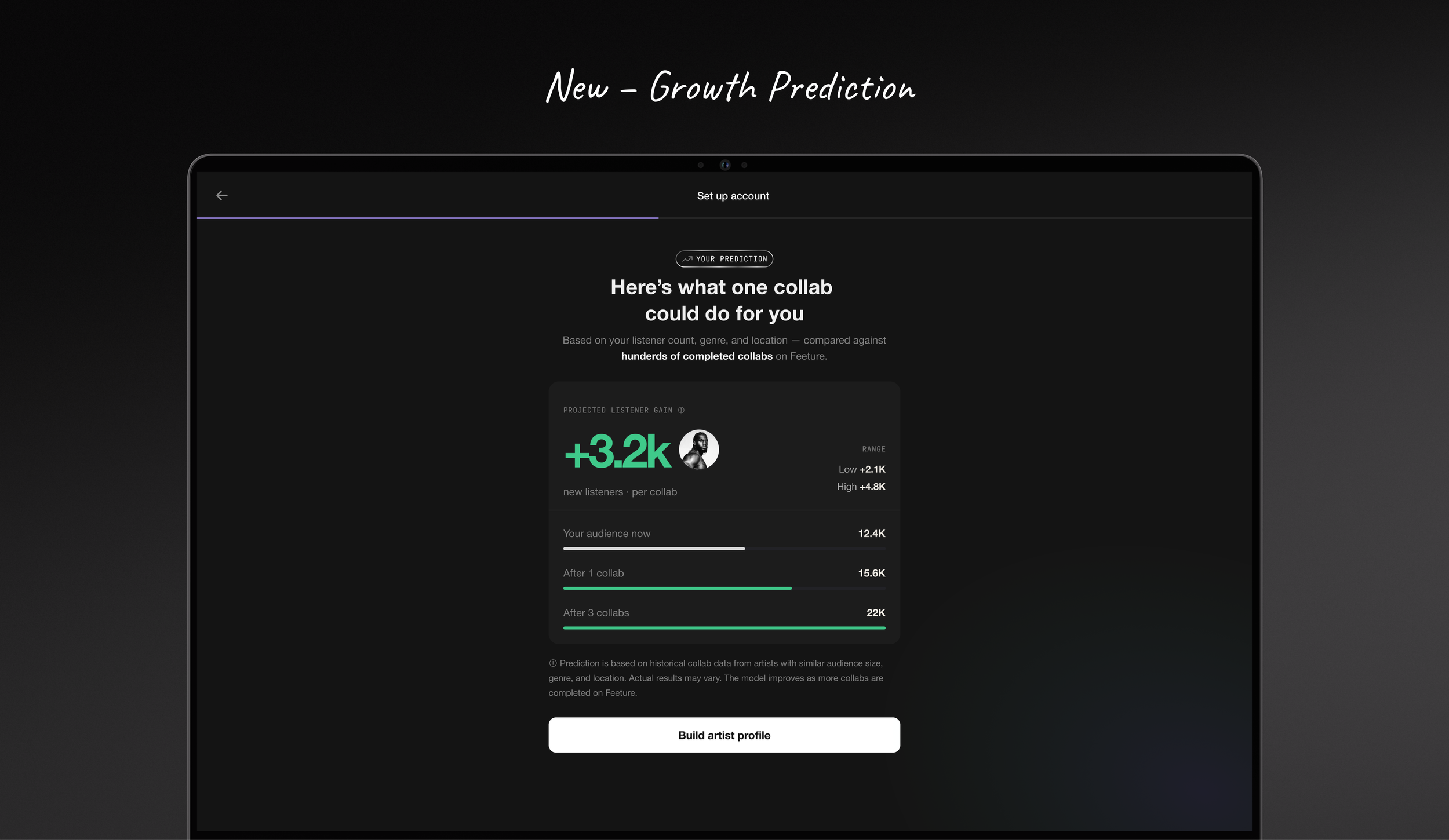
Once artists have entered enough about themselves, we show them a personalised growth prediction — how much their audience could grow if they collaborate and invest in it. It gives them a reason to keep going, and a glimpse of what the platform is actually for, before we ask for anything else.
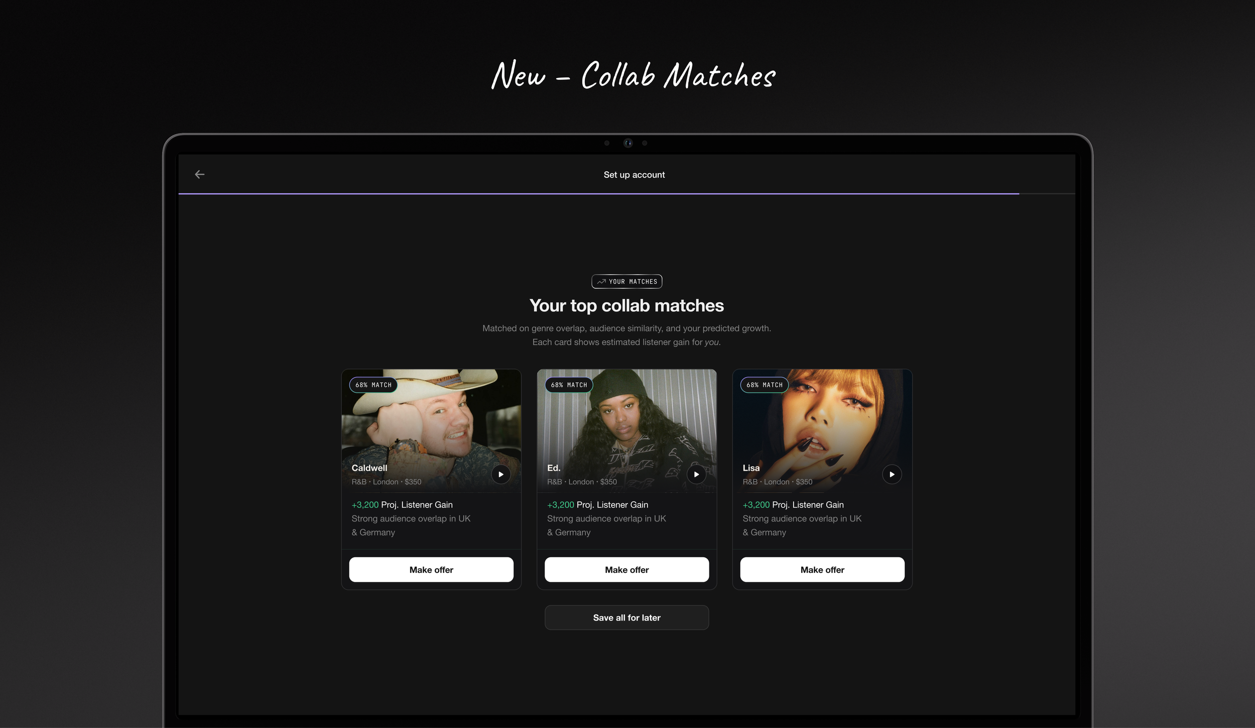
At the end of the flow, we use everything the artist just told us to recommend their best collab matches. Instead of dropping them into an empty app, we hand them a short list of artists worth reaching out to, making that first collaboration feel like an obvious next step.
Results
New flow tested with 6 artists through moderated usability sessions.
Measured task completion, comprehension, and whether users understood the core model.
All 6 completed onboarding successfully; the two-role model (who pays, who creates), value proposition and which steps to take next, were understood without explanation.
Artists described the flow as clearer and easier to understand than the original, and said they finished it knowing what to do next.