
Helping kitchens manage menus, orders, and the kitchen line from one ecosystem
Three connected apps for a Swedish ghost kitchen startup.
Context
Eatable is a Swedish food-tech startup focused on ghost
and virtual kitchens founded in 2021. Founder is an
ex-Delivery Hero manager.
Initially operated their own delivery-only (ghost) kitchens. Later expanded by franchising virtual restaurant concepts.
As they scaled, they needed internal tools to manage menus, orders, and kitchen operations across multiple food delivery platforms. What started as software for their own kitchens eventually became the product itself — they decided to turn these tools into a business and sell them to other kitchens facing the same problems.
Project timeline
Sep 2021 – Apr 2022
Industry
Foodtech
B2B, Saas
Type
Web app,
Non-responsive
My role
Lead Product Designer
UX Researcher
Team
1 Product Manager
1 Product Designer
3 Back-End Engineers
2 Front-End Engineers
2 QA Engineers
Background
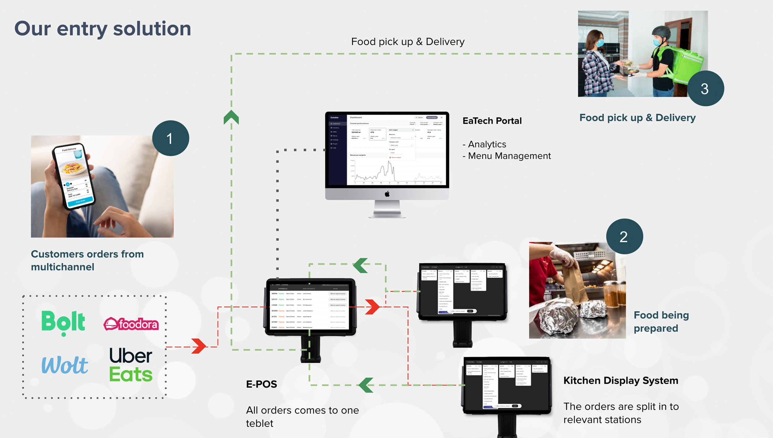
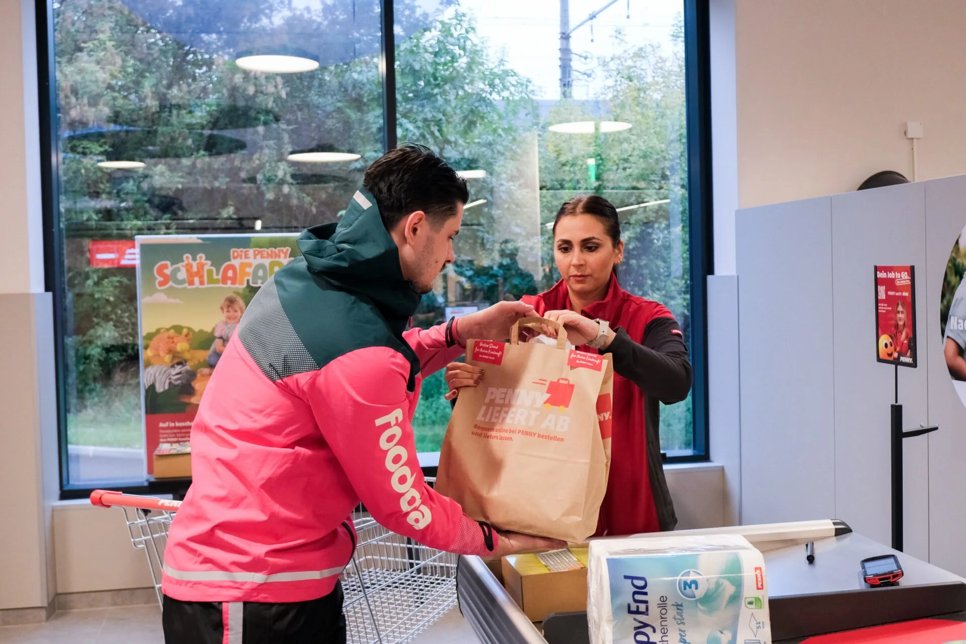
Restaurants and ghost kitchens in Europe usually sell through four or more delivery platforms at once — Uber Eats, Foodora, Wolt, and Bolt among them — and each platform brings its own interface, menu structure, and rules, with no single tool to manage them together.
Eatable ran into this while operating its own kitchens, and recognized that every ghost kitchen in Europe was working around the same fragmented setup, which is what turned an internal fix into a product.
PROBLEMS One menu change meant up
to 40+ manual edits
Updating a single menu item across 10 menus on 4 platforms could take up to 40 separate edits, and one pricing mistake made along the way would surface on every platform at once. This led to errors, menu inconsistencies and a lot of time spent.
Orders came in on four or more
separate tablets
Delivery managers watched Uber Eats, Foodora, Wolt, and Bolt each on its own device, switching between four screens and losing track of orders exactly when the kitchen was busiest.
Kitchen staff couldn't see order statuses and lost order tickets
Cooks worked from printed tickets or spoken instructions, with no live view of what needed preparing, in what order, or how far along each order already was.
Outcomes
10x faster menu updates
20% lower labor costs
90% menu accuracy
5x customer satisfaction (beta NPS)
Sold to kitchens in Sweden and Spain
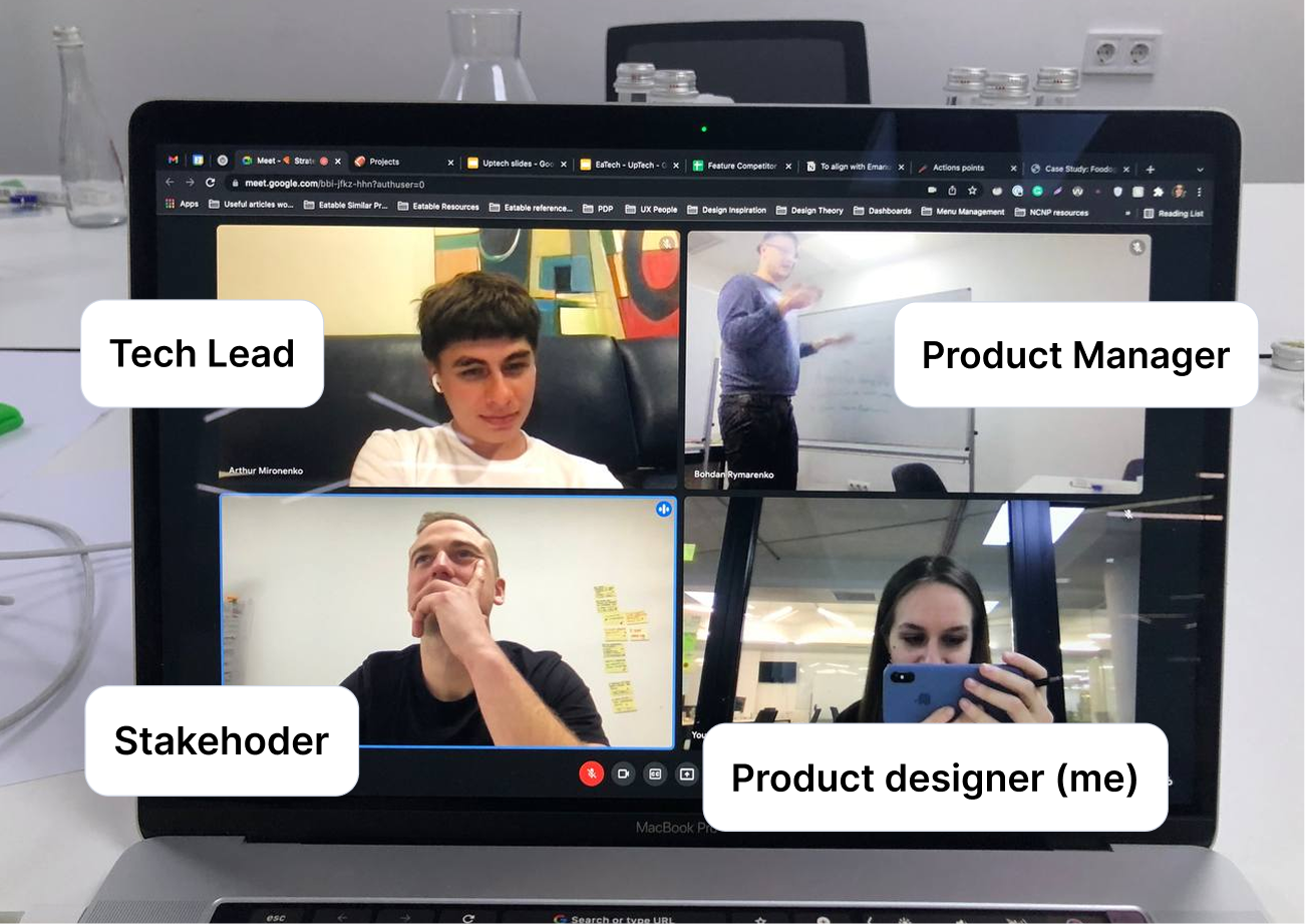
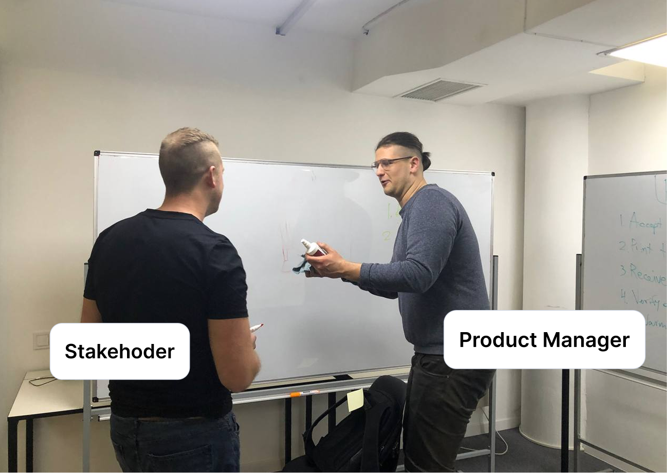
DISCOVERYOur client, Emanuel, during his time in Kyiv for product workshops
Key research phases
Our research consisted of three phases:
stakeholder workshops with our client (&domain expert),
user interviews and market analysis.
Stakeholder workshops — sessions with the Eatable founder (ex-Delivery Hero) to map existing operations and find where time and money were leaking. Key insight: businesses didn't want a better version of the same tool so much as a way to stop repeating one change 40 times over.
User interviews — conversations with restaurant managers, kitchen staff, and delivery coordinators. Most spoke Swedish or Arabic, and our client helped with translation. Key insight: people trusted the interfaces they already used every day, like Foodora and Uber Eats, so the tool would land best if it followed patterns they recognized rather than introducing new ones.
Marketplace analysis — a review of 50+ menus and each platform's API constraints to understand what could and couldn't be standardized. Key insight: the tightest constraints came from the platforms rather than from the people using the tool, and that shaped what was possible to unify at all.
After research, here’s what I did
Analyzed 50 menus across the Swedish and global market to decide which menu adjustments the MVP would support, which set the scope of the whole information architecture.
Mirrored marketplace UI patterns in menu management, after testing showed people navigating by muscle memory from Foodora and Uber Eats.
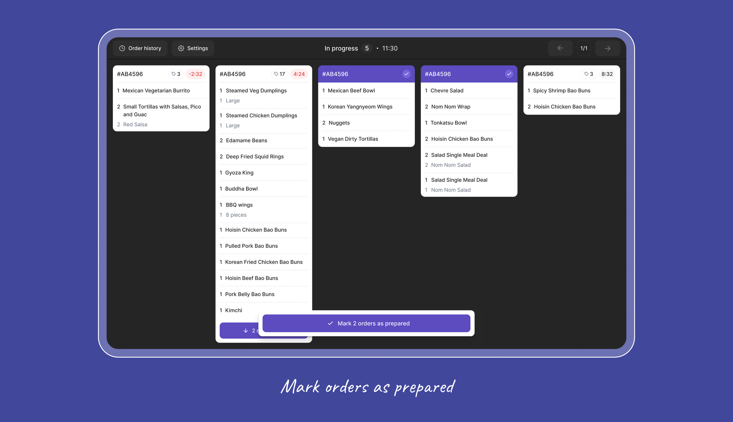
Designed the kitchen display around how cook stations actually work (and tested!), showing orders by preparation stage rather than by platform, reducing any scroll actions and adapting UX for kitchen environment.
Built and maintained a design system so the three products stayed consistent as they developed in parallel.


For the launch of MVP,
we targeted two types of businesses:
Ghost/virtual kitchen businesses, that operated their own brands and/or their own kitchens + franchises they sold to customers
Small fast food chains/kiosks
Informational architecture planning
One of the biggest challenges of this project was the need to align
with cross-functional requirements to adhere to the limitations of the different marketplaces (Uber Eats, Foodora, Bolt, etc) we were integrating with.
In order to tackle this we analyzed marketplace requirements
and around 50 different menus on the Swedish market to identify the structural differences these menus have and narrowed down the list of key menu adjustments we would allow in the MVP version of our product.
With informational architecture at hand,
I started exploring visual solutions
Design process included multiple rounds of feedback and iterations:
I created prototypes → Presented and discussed them with the product team (PM, engineers), and client → Conducted a round of usability testing with users → Made adjustments based on received feedback → Repeated the process if necessary → Prepared design handoff.
I had to move fast to show early screens and shorten the feedback loop, as each phase required a lot of approvals and updates, as we gathered new information.
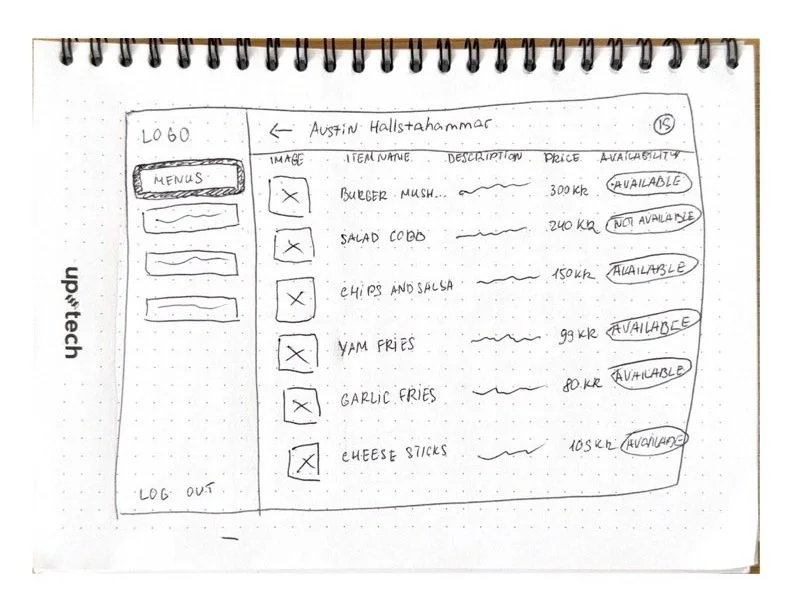
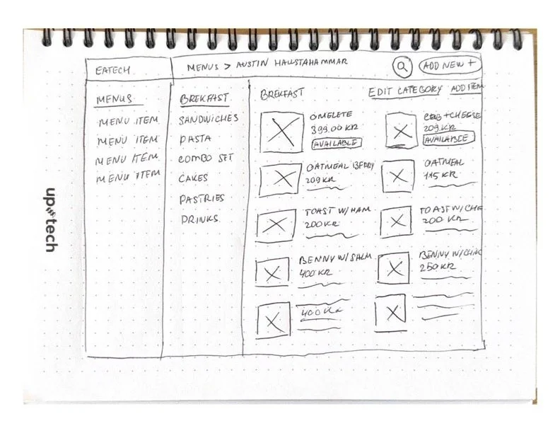
Drafting first ideas for Menu page
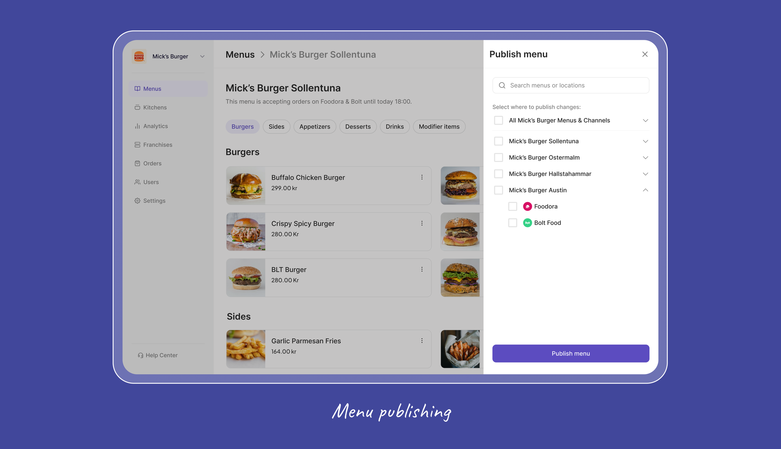
Menu Publishing
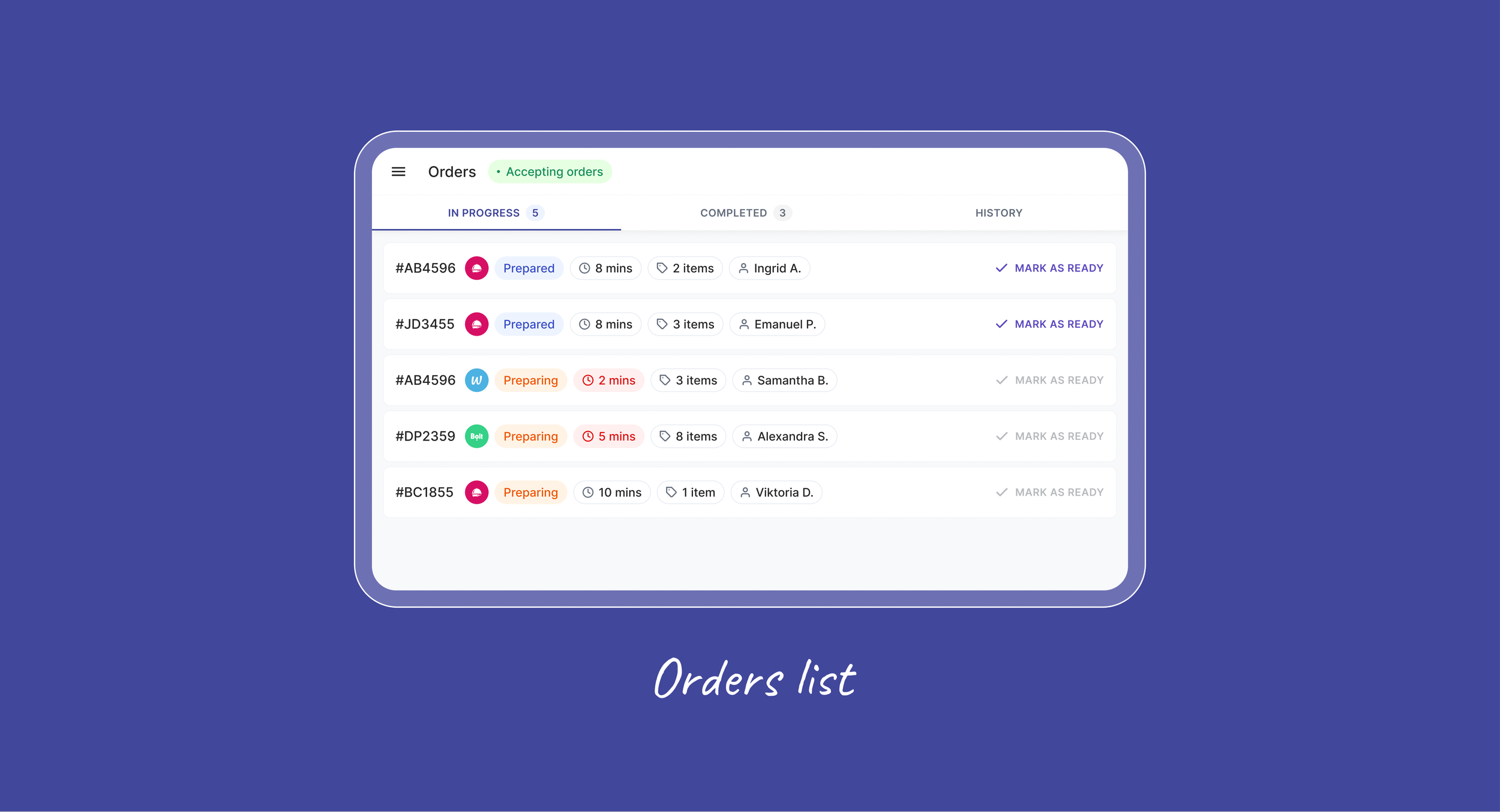
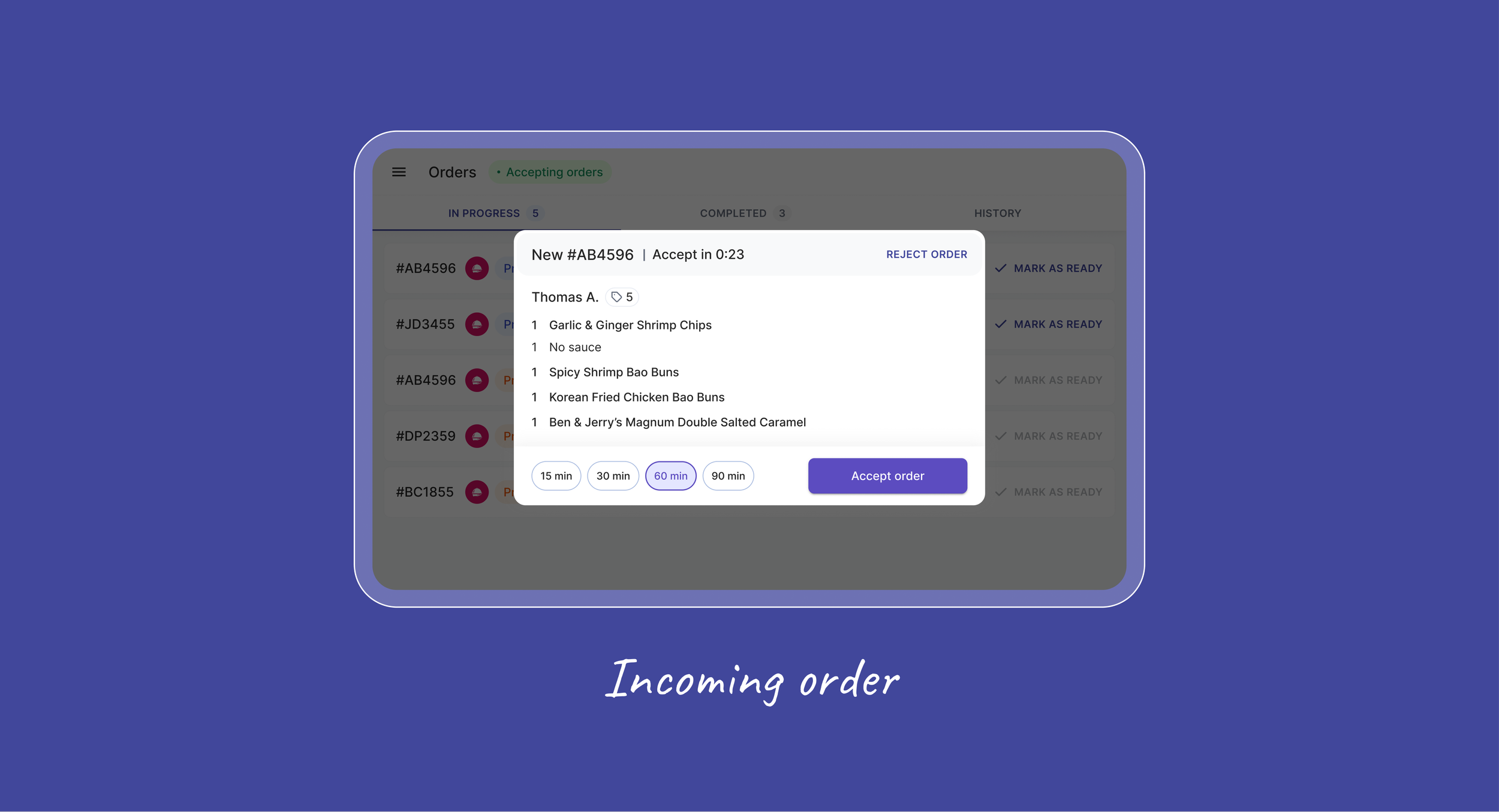
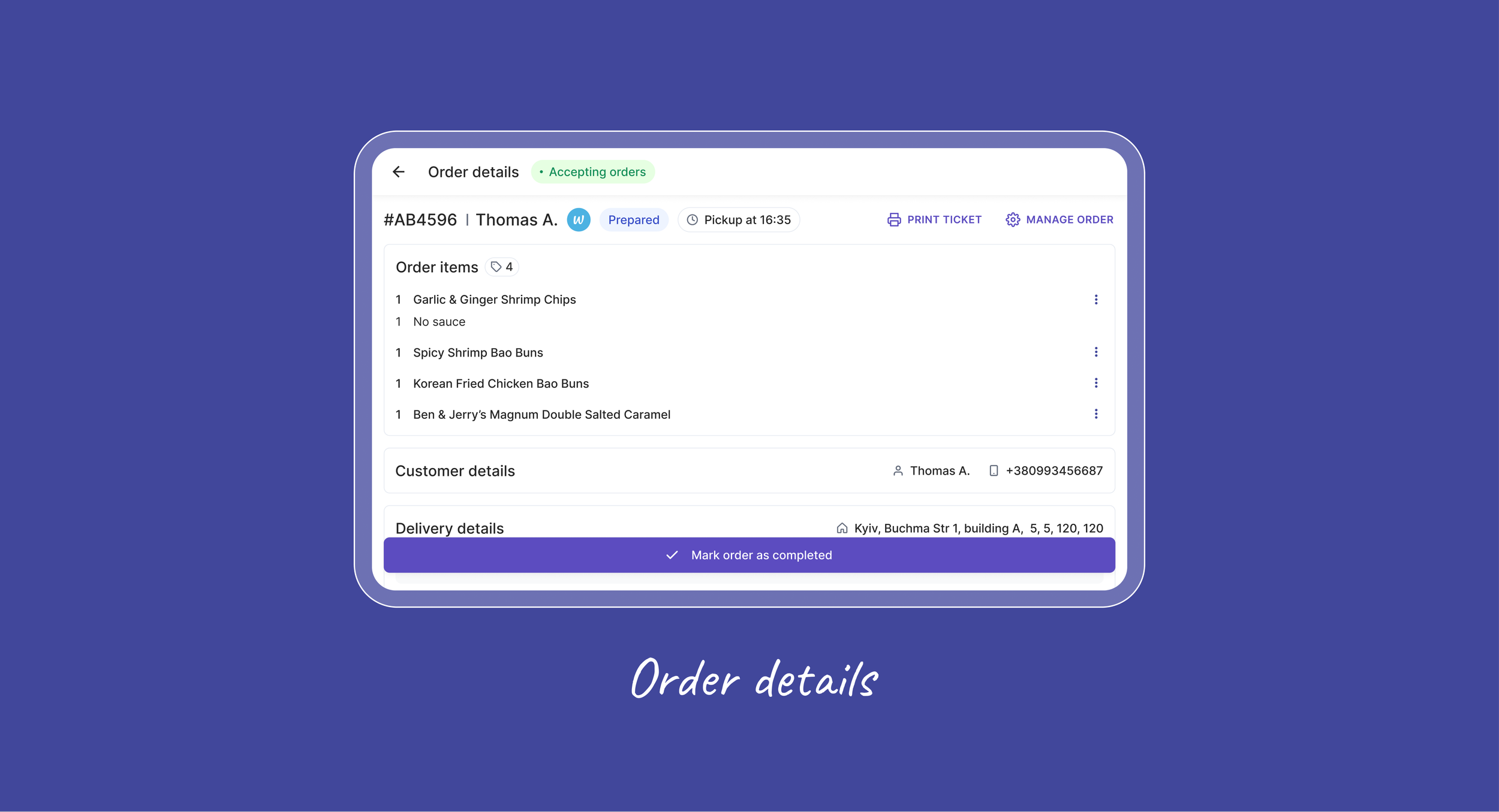
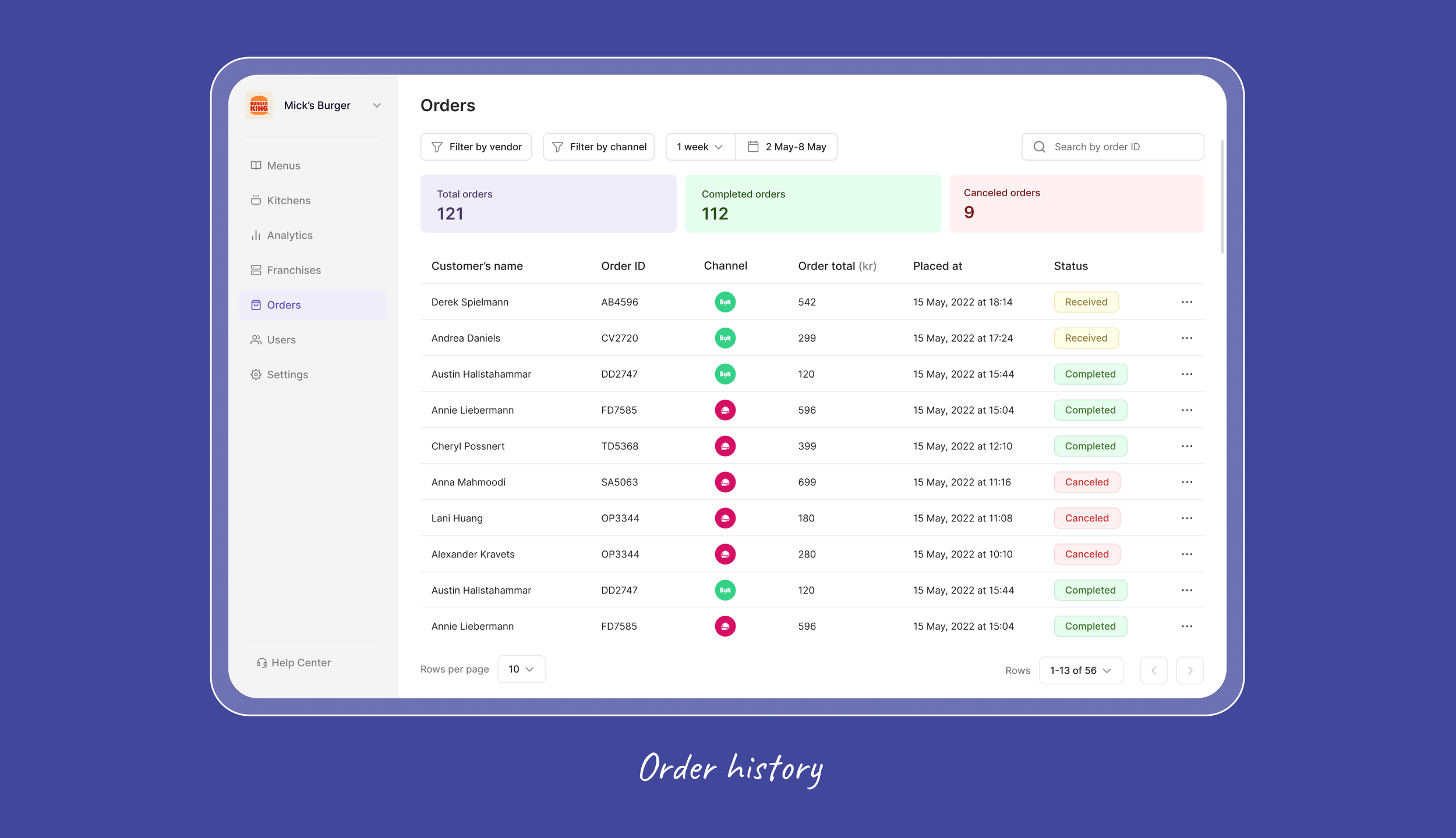
Delivery (Order) Management
Every platform's incoming orders gathered into one tablet interface, so delivery managers could track, assign, and coordinate them without switching devices during the busiest hours.
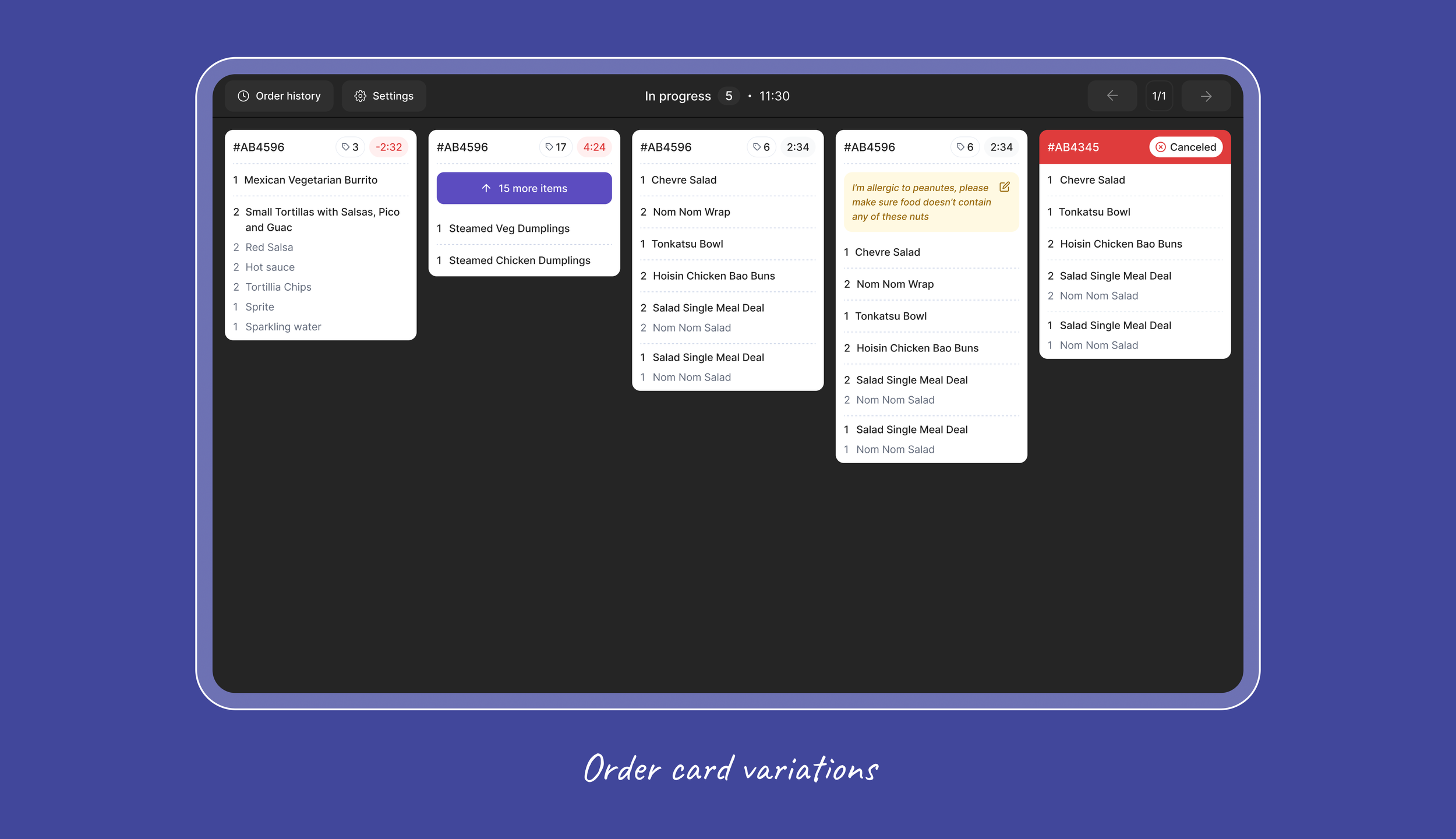
Kitchen Display System
A live view for kitchen staff of what needs preparing, in what order, and at what stage, replacing printed tickets and spoken instructions with a structured picture of the kitchen
that stays current.
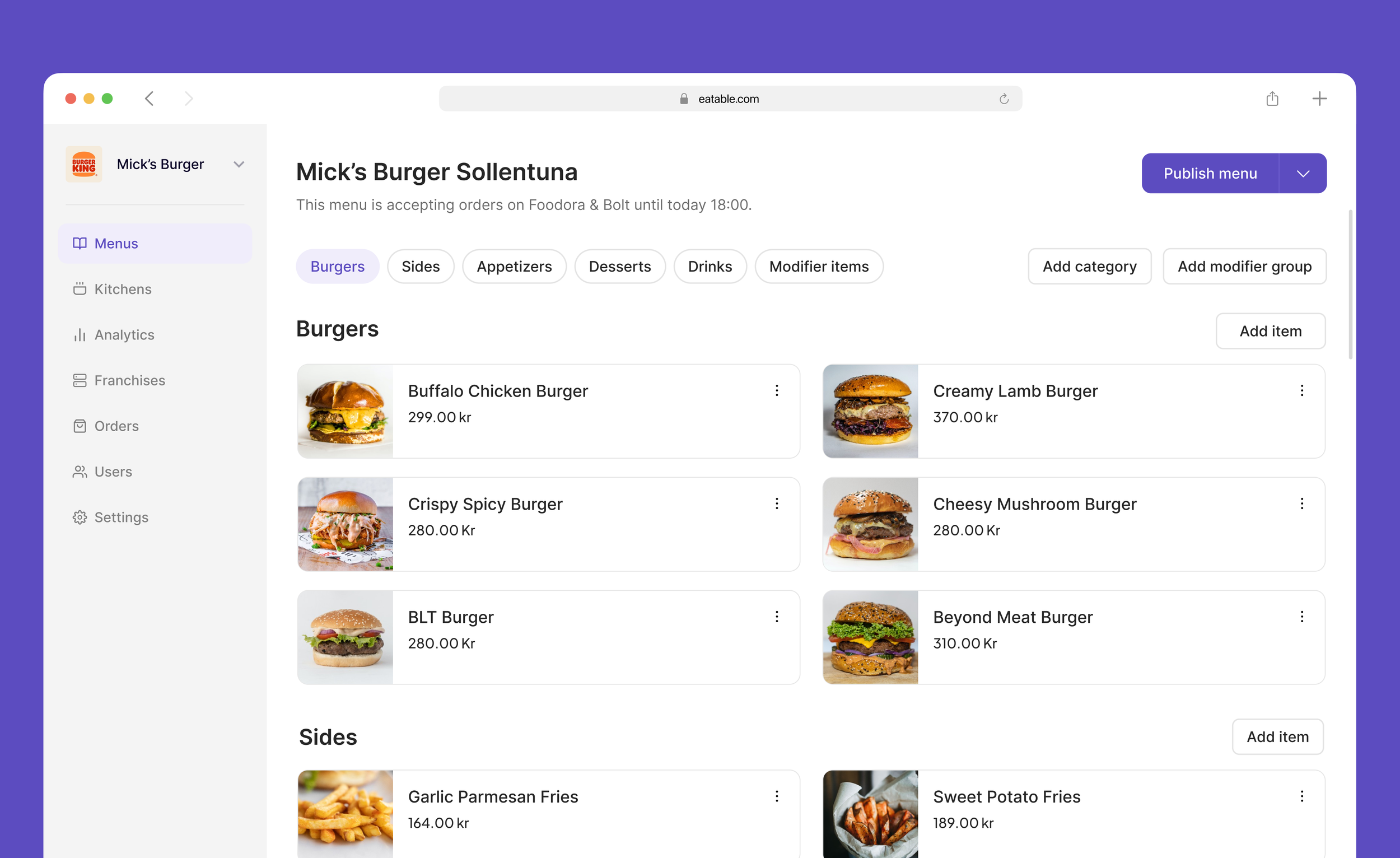
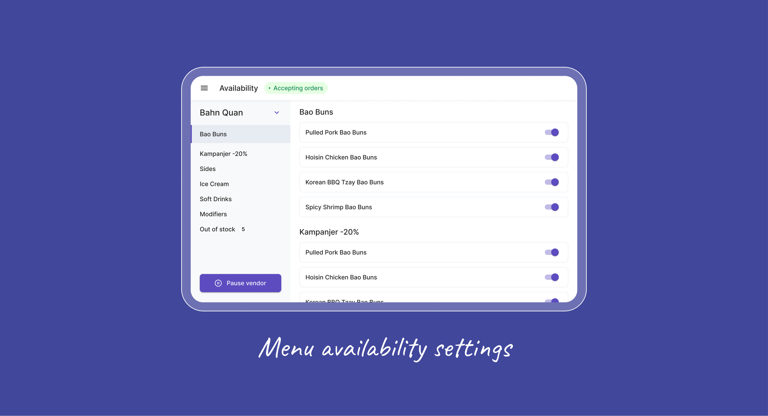
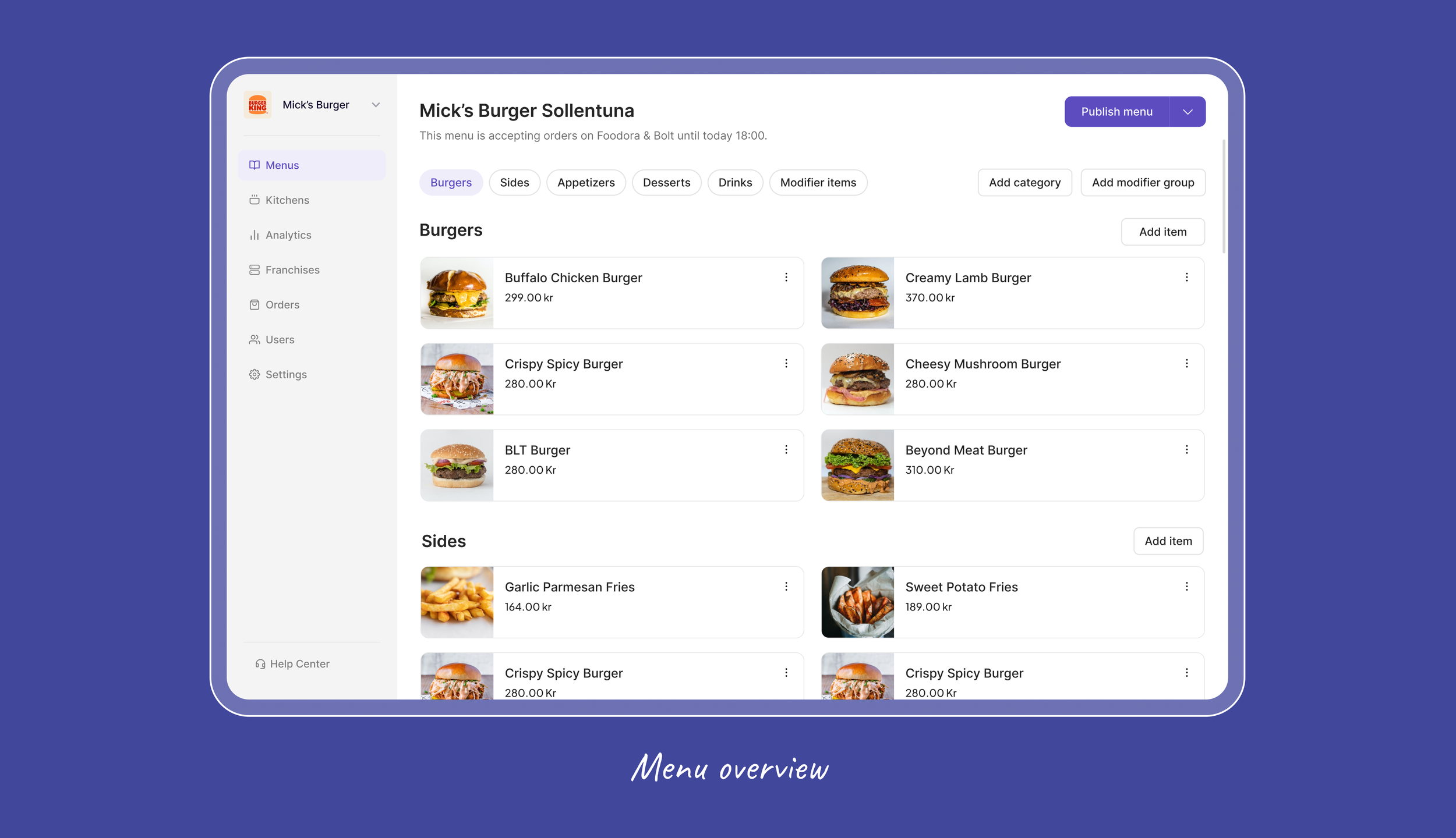
Menu Management
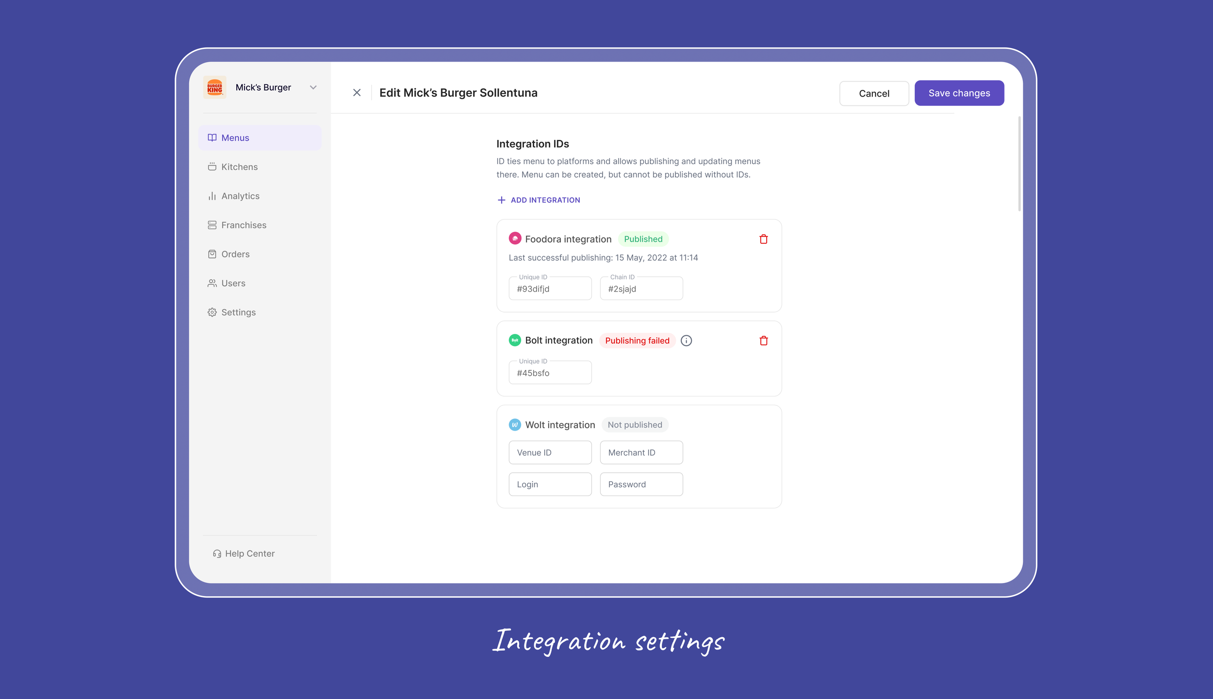
A single place to update prices, availability, items, and modifiers, then publish them at once across Uber Eats, Foodora, Wolt, Bolt, and others. The 40 manual changes that one update used to take now happen in a few clicks.
FINAL DESIGNS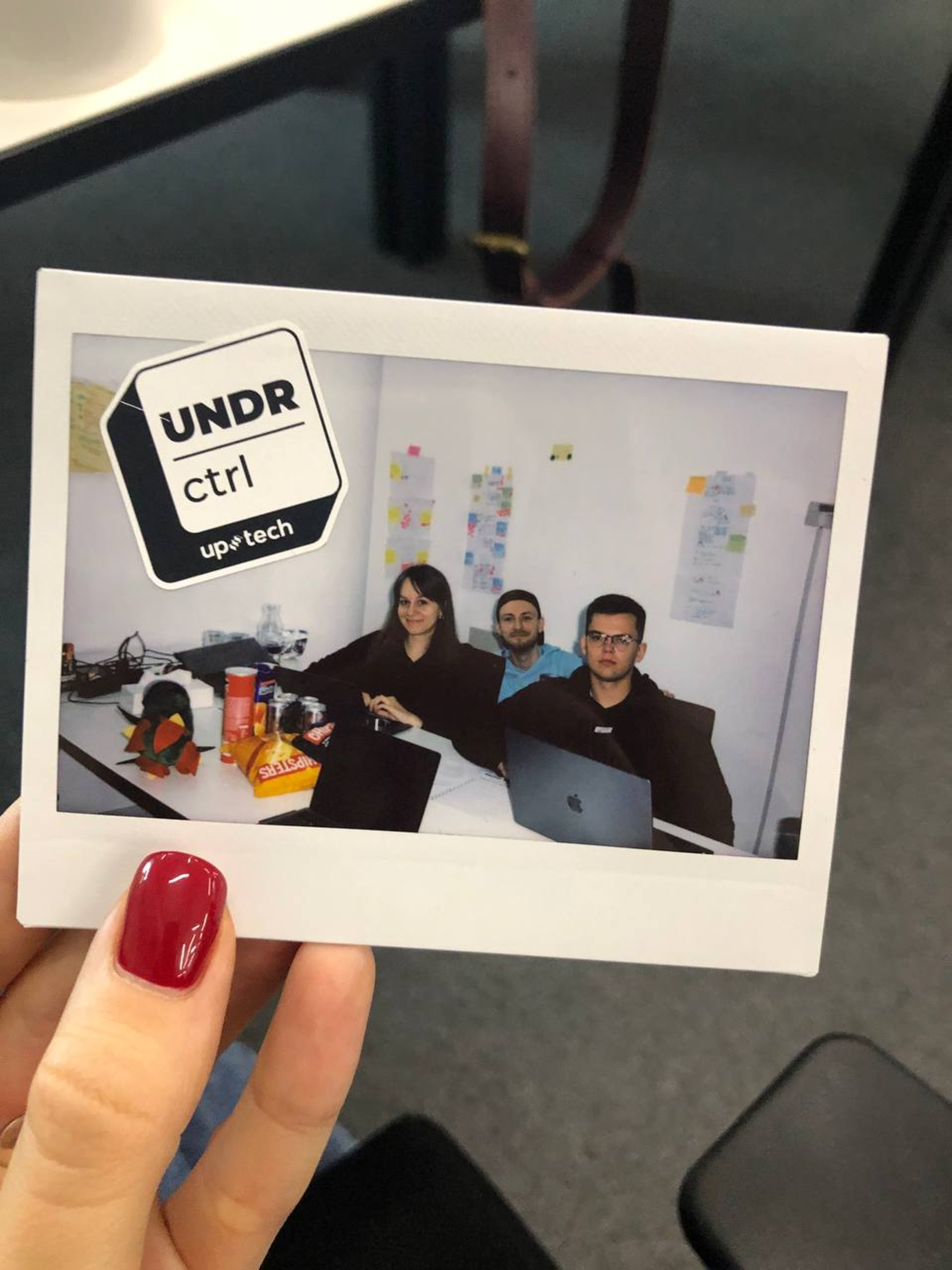
Key learnings
The constraints that mattered most weren't obvious at the start. Each delivery platform had its own API rules that quietly shaped what we could design, and understanding those limits early ended up guiding every information-architecture decision.
In operational tools, familiarity tends to beat novelty.
People working a busy kitchen have no time to learn new patterns and lean on tools that feel like the ones they already know.
You can't design for a kitchen from a desk. Spending real time with kitchen staff was the only way to understand their environment — it's what told us the KDS couldn't rely on scrolling, since cooks can't stop to swipe mid-rush. Those details only showed up by watching people work.