
Streamlining ghost kitchen operations: Replacing 4+ tablets, 40+ clicks, and lost paper tickets with one system
Three connected apps for a Swedish ghost kitchen startup.
Context
Eatable is a Swedish food-tech startup focused on ghost
and virtual kitchens founded in 2021. Founder is an
ex-Delivery Hero manager.
Initially operated their own delivery-only (ghost) kitchens.
Later expanded by franchising virtual restaurant concepts.
They needed tools to manage menus, orders, and kitchen operations across multiple delivery platforms — first for themselves, then to sell to other chains facing the same chaos. I designed three connected systems from scratch as the sole designer on a team of seven.
Project timeline
Sep 2021 – Apr 2022
Industry
Foodtech
Saas
Type
Web app, Non-responsive
My role
Lead Product Designer
UX Researcher
Team
1 Product Manager
1 Product Designer
3 Back-End Engineers
2 Front-End Engineers
2 QA Engineers
PROBLEMUpdating a single menu item required up
to 40 changes across delivery platforms.
Small food businesses and restaurant chains, like Eatable, face
a significant challenge in keeping their menus up-to-date on delivery apps like Uber Eats, Glovo, Foodora, and Bolt, as well as on their own platforms. For instance, if a restaurant manager needs to update a single menu item across 10 different menus on these four platforms, it can require up to 40 individual changes. This not only consumes valuable time and effort but also introduces a high risk of errors, leading to menu inconsistencies that can adversely affect customer experience, and make a negative impact on revenue and operational efficiency.
Goal
Build an MVP version of a tool that helps small food businesses and ghost kitchen chains easily manage and update their menus simultaneously on delivery apps like Uber Eats, Glovo, Foodora, and Bolt, etc. while also keeping their own menus organized.
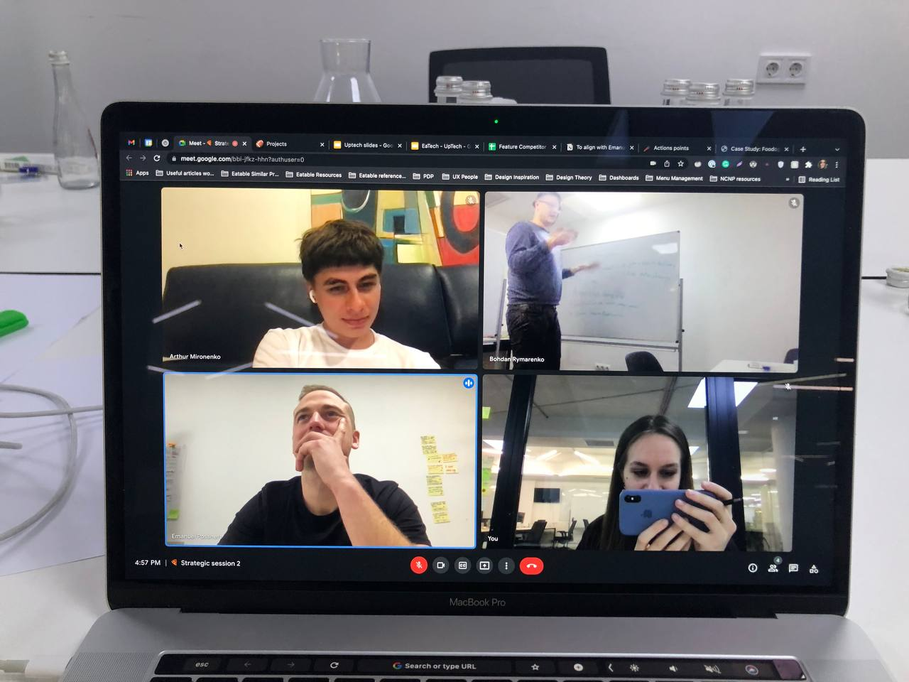
Our client, Emanuel, during his time in Kyiv for product workshops
Gaining insights
into foodtech domain
We initiated the project by conducting workshops with our clients, aiming to understand their expectations and leveraging their extensive experience in the food tech field, gained from previous roles at Delivery Hero and years of experience working on ghost/virtual kitchen concept development.
We spent hours discussing businesses’ feedback to outline the main blockers and pain points:
Businesses often struggled to spend hours on routine communication and manual updates instead of automation due to a lack of technical skills;
Most existing tools were not affordable for small businesses, preventing them from considering switching in the first place;
Some menu management tools used by businesses require the usage of spreadsheets / spending a lot of time on calls with the support team in addition to software.
Occasional mistakes made during menu updates resulted in significant financial losses and customer complaints
We learned that businesses experience a lot of losses
As most users spoke Swedish or Arabic, and we couldn't afford an interpreter, our client assisted with translations. Despite the process being somewhat hectic and expensive, we compensated for potential missed insights by conducting expert interviews, which contributed valuable industry insights.
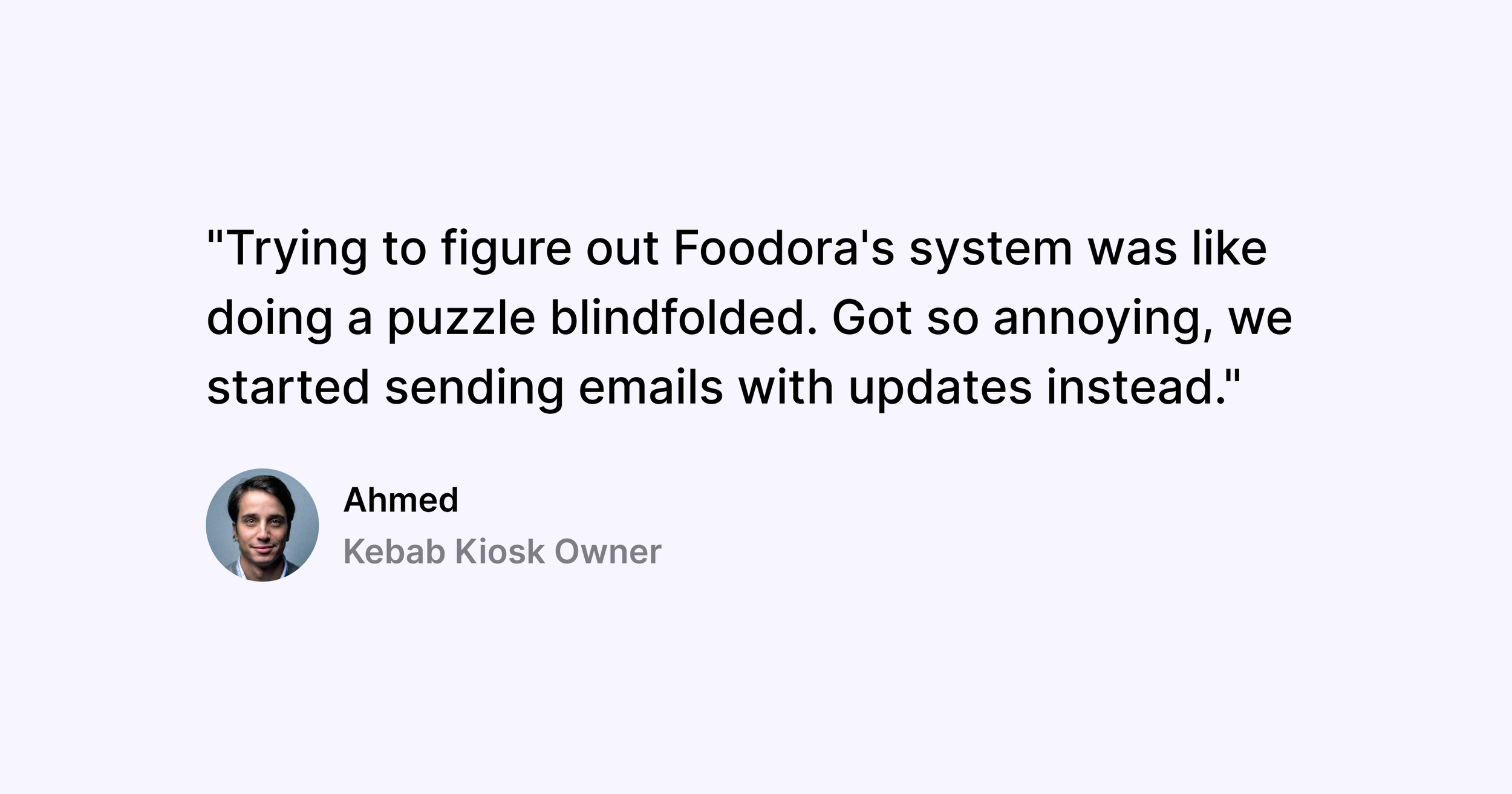
"Trying to figure out Foodora's system was like doing a puzzle blindfolded. Got so annoying, we started sending emails with updates instead."
Ahmed, Owner of kebab kiosk
“Speed matters a lot in fast food businesses,
so updates that take at least 48 hours to be displayed on the marketplace affect us a lot”
Johanatan, Line Cook
"I prefer to update menus by myself and by hand, one pricing mistake costs us more than I'd like to admit."
Henrik, Manager at Eatech’s kitchen
“As we grow, our main struggle is to do bulk updates for franchises as there are a lot of them.”
Prakash, Owner of small fast food chain
…and 15+ other insights
Target Audience
For the launch of MVP,
we targeted two types of businesses:
Ghost/virtual kitchen businesses, that operated their own brands and/or their own kitchens + franchises they sold to customers
Small fast food chains/kiosks
Next, we conducted
a prioritization session
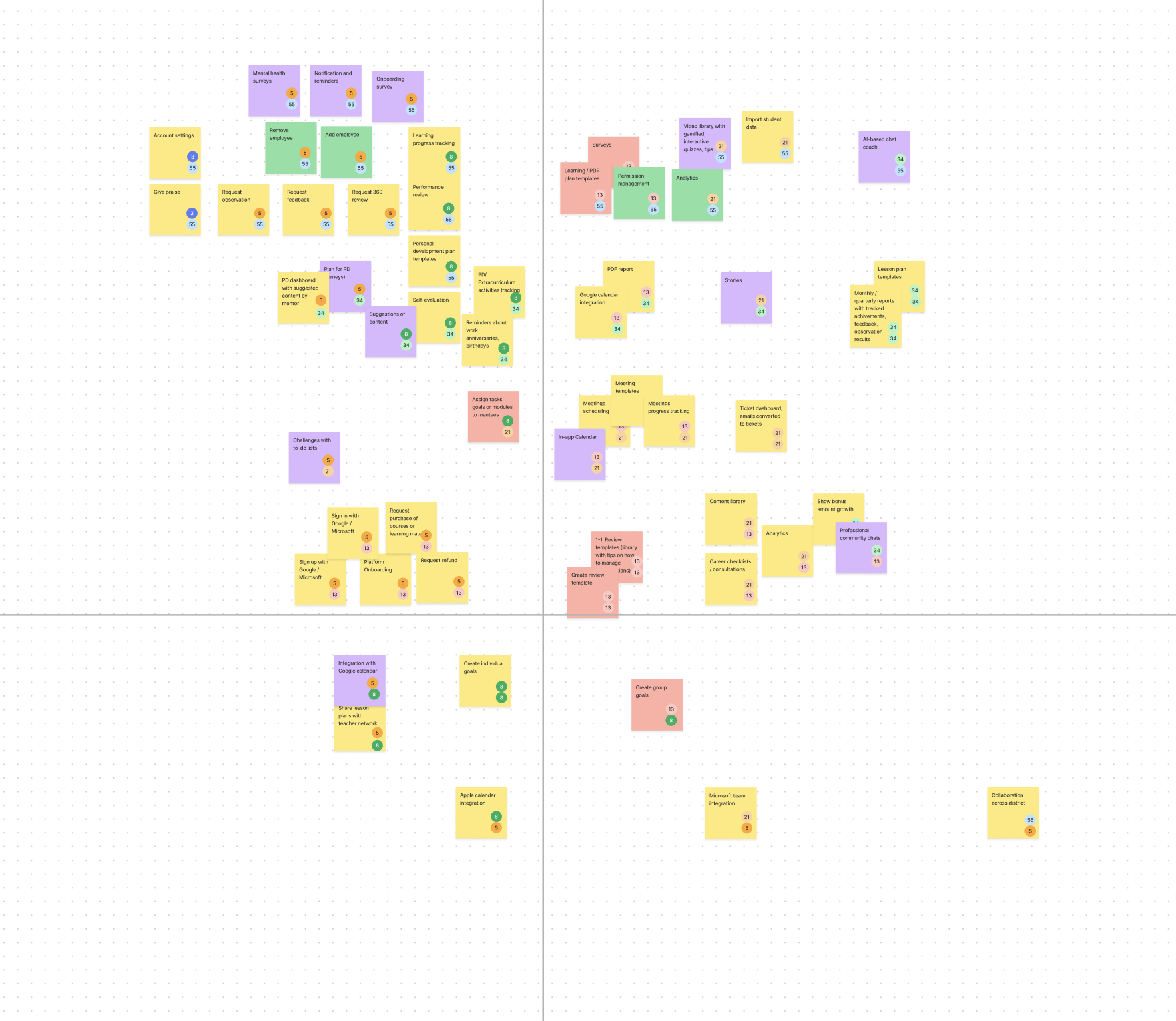
After we’ve gathered requirements and summarized findings from user research we conducted a feature prioritization workshop and defined a set of features, using the value vs. effort framework we narrowed down the list of features we needed to create for MVP.
List of features we defined:
Managing menu: updating prices, managing item’s availability, updating items (modifiers, titles, descriptions, etc)
Publishing menus to marketplaces (Uber Eats, Bolt, Wolt, etc)
Managing kitchens (turning on/off kitchens, kitchen stations).
Basic order analytics
Order management
User management
Informational architecture planning
One of the biggest challenges of this project was the need to align
with cross-functional requirements to adhere to the limitations of the different marketplaces (Uber Eats, Foodora, Bolt, etc) we were integrating with.
In order to tackle this we analyzed marketplace requirements
and around 50 different menus on the Swedish market to identify the structural differences these menus have and narrowed down the list of key menu adjustments we would allow in the MVP version of our product. As these requirements changed as we integrated with new platforms, the informational architecture helped overlook areas of the interface that would be affected by these updates.
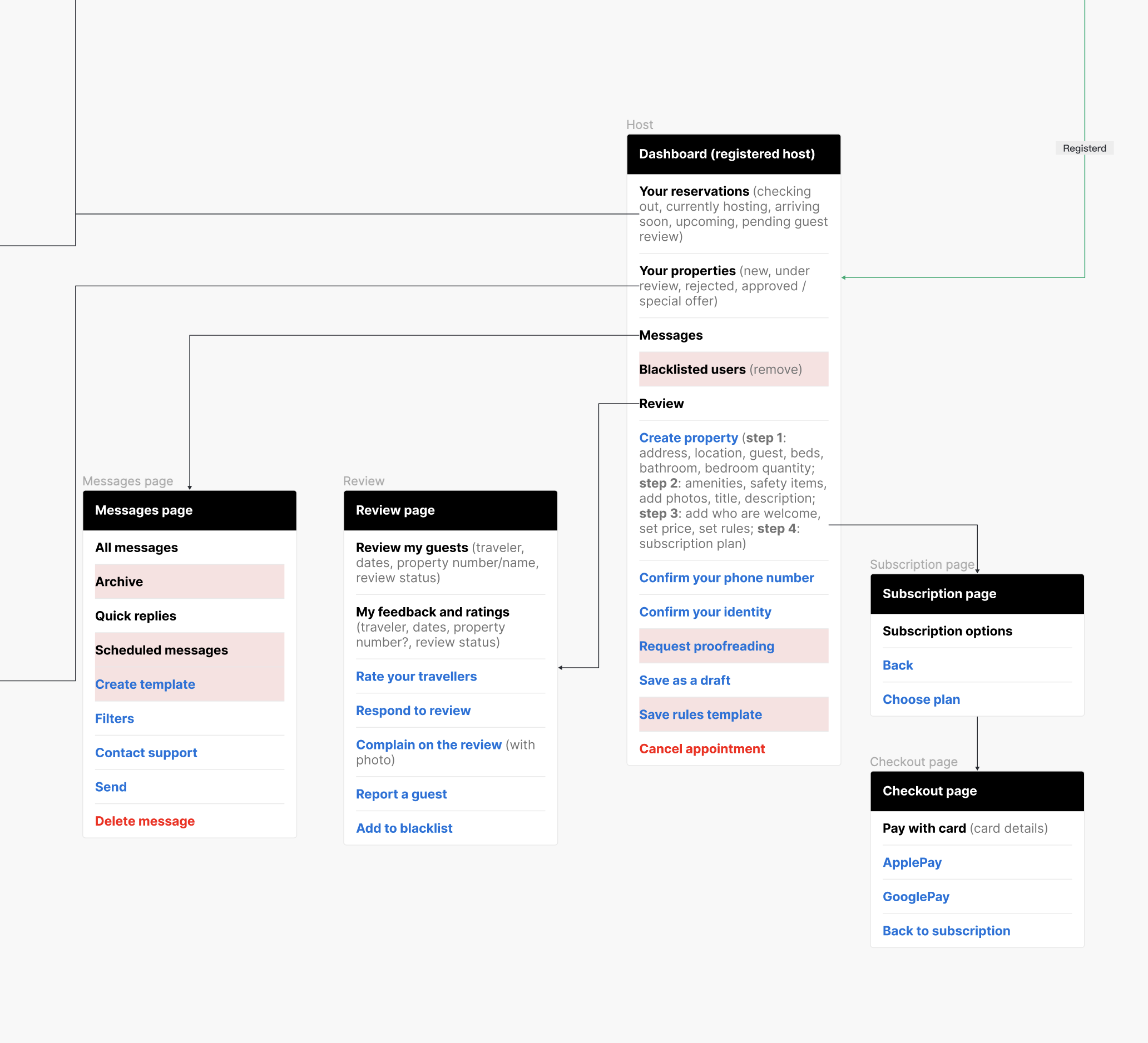
With informational architecture at hand,
I started exploring visual solutions
Design process included multiple rounds of feedback and iterations:
I created prototypes → Presented and discussed them with the product team (PM, engineers), and client → Conducted a round of usability testing with users → Made adjustments based on received feedback → Repeated the process if necessary → Prepared design handoff.
I had to move fast to show early screens and shorten the feedback loop, as each phase required a lot of approvals and updates, as we gathered new information.
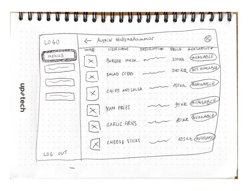
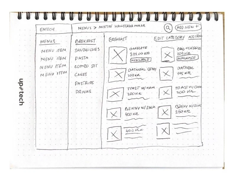
Drafting first ideas for Menu page
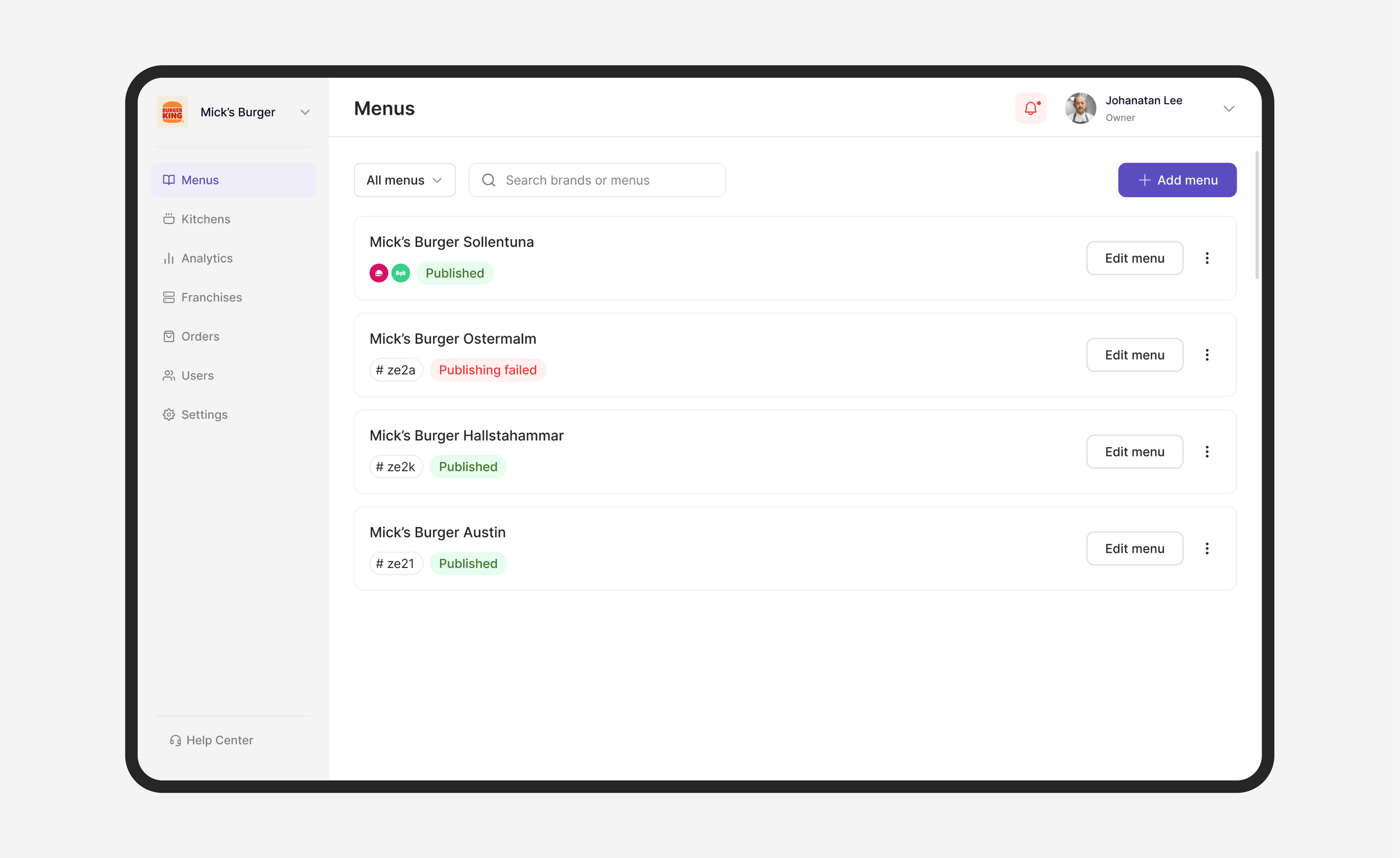
Menu Overview
Kitchens
After a few rounds of iterations,
here’s what final designs turned out like
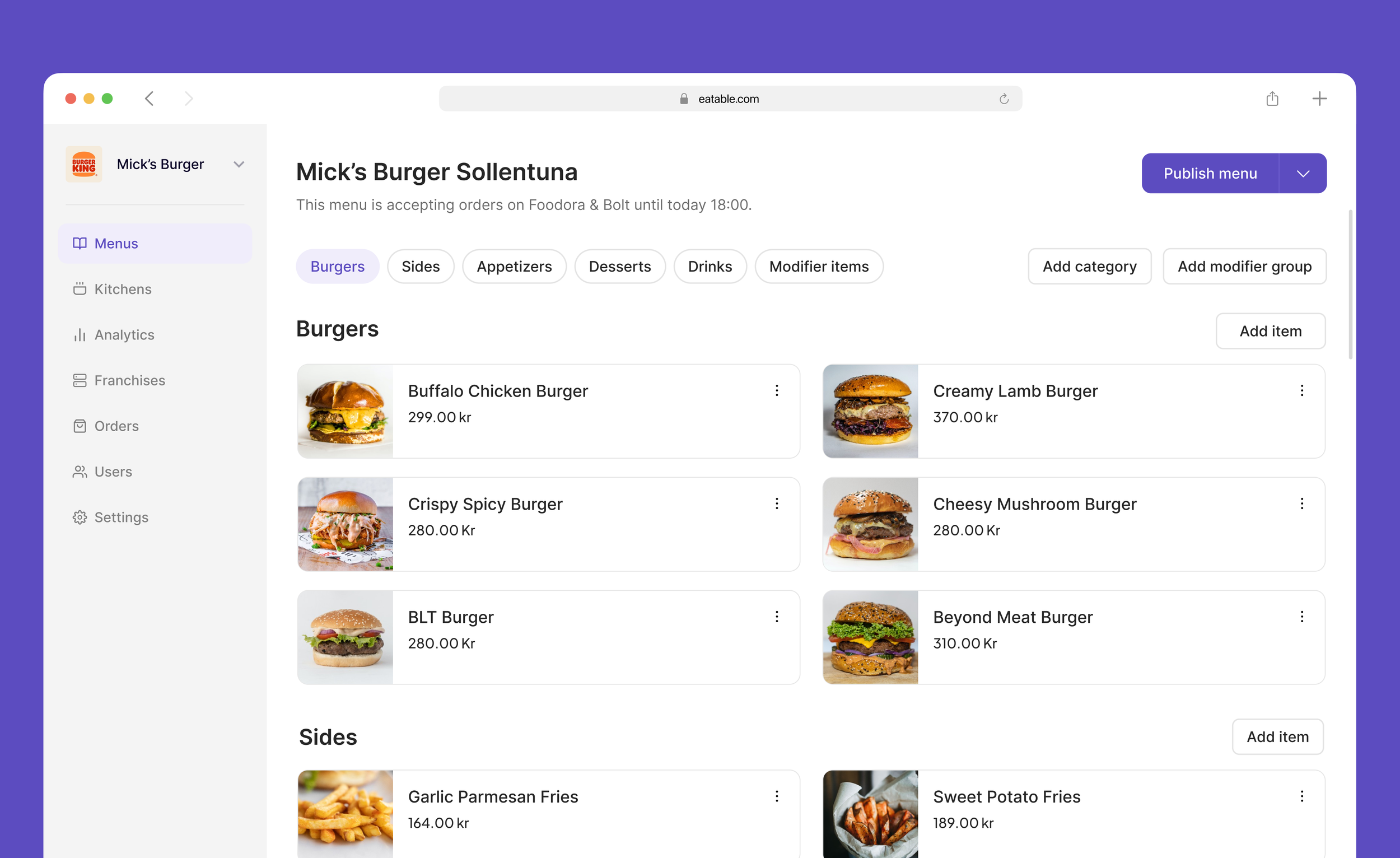
This screen has seen many iterations, as it had a lot of power and was frequently used by many people. During usability testing, we noticed that a lot of people were referring to the UI of marketplaces they are used to working with. We decided to keep the interface of our tool similar to what those platforms possess because it helped users navigate through menus more efficiently.
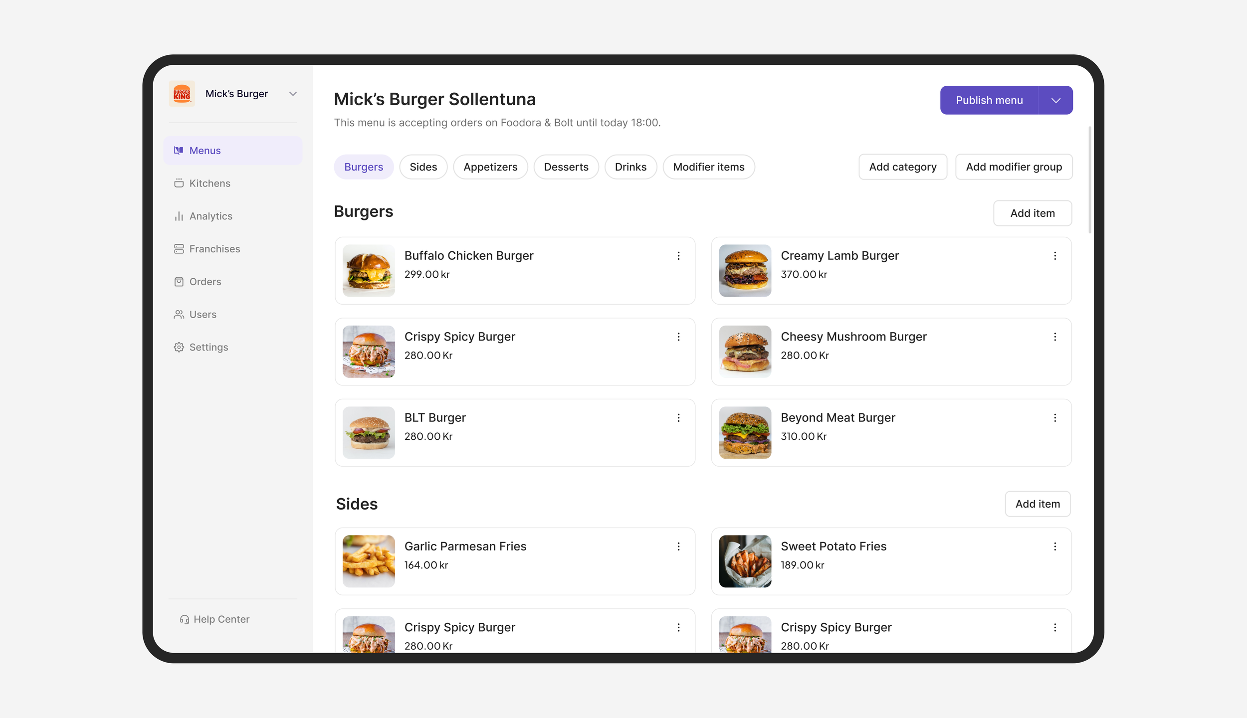
This screen has seen many iterations, as it had a lot of power and was frequently used by many people. During usability testing, we noticed that a lot of people were referring to the UI of marketplaces they are used to working with. We decided to keep the interface of our tool similar to what those platforms possess because it helped users navigate through menus more efficiently.
Item editing
This screen has seen many iterations, as it had a lot of power and was frequently used by many people. During usability testing, we noticed that a lot of people were referring to the UI of marketplaces they are used to working with. We decided to keep the interface of our tool similar to what those platforms possess because it helped users navigate through menus more efficiently.